For keyboard-only users, knowing which element has focus at any given time is incredibly important (as covered very recently in How To Avoid Breaking Web Pages For Keyboard Users).
But I’m getting ahead of myself. Based on Success Criterion 2.4.7 Focus visible, any keyboard-operable interface needs to have “a mode of operation where the keyboard focus indicator is visible”.
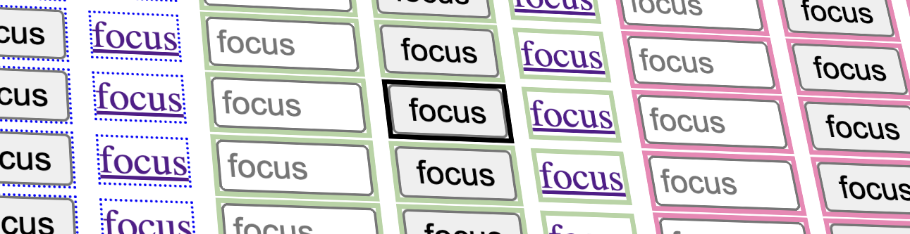
The keyboard user’s focus indicator can take different forms, perhaps most commonly seen as a solid or dashed outline around buttons and links.
Focus indicators let keyboard users know where they are while they’re navigating from one interactive control to another, typically with Tab and Shift+Tab
Focus indicators are something that auditors test for when reviewing a site, but it so happens that a poorly discernible focus indicator is only a WCAG failure if that focus indicator uses custom styling; default focus indicators are exempt even if they’re bad focus indicators, at least if the audit is at AA level. If the audit is at AAA level, a native focus indicator that has poor contrast against an author-defined background can fail under SC 2.4.13 Focus Appearance.
So how can an auditor be sure that they’re looking at a custom-styled focus indicator versus the default styling provided by the browser or operating system?
Testing a web page’s focus indicator can sometimes be a bit challenging because it isn’t always easy to tell whether the focus indicator that you’re looking at is customized (where the developer has defined a style in CSS) or it’s provided by the browser (native default). Identifying whether a visual indicator comes from the browser or comes from the developer’s custom CSS makes a difference between whether that might count as a failure.
Why is visible focus important?
Visible focus is important for several reasons:
- Accessibility: Focus indicators are essential for users who rely on keyboard navigation, people who make use of screen readers, and people with motor disabilities. Focus indicators clearly indicate which element is currently focused, helping users to know where they are in a web page or application.
- Reduced Errors: Focus indicators helps users, including those with cognitive or visual impairments, accurately select elements and controls. This can reduce accidental actions or errors.
- Consistency: A visible focus indicator provides a consistent and predictable user experience. Users can be confident that they know where they are on the page and where their next move will take them.
- User Experience: Focus indicators enhance the overall user experience for everyone. Clear and visible focus indicators make navigation and interaction more intuitive, which helps all users—not just those with disabilities.
- User Feedback: Focus indicators provide immediate feedback to users, indicating that their actions are being registered. This is valuable for building trust and engagement with the interface.
The evolution of default visual indicators
If custom focus indicator styles aren’t set, browsers will default to their own built-in styles. The visual indicator provided by each browser has changed over time, and although the default focus indicators across modern browsers generally are in good shape, these defaults haven’t always met the WCAG’s minimum contrast thresholds.
In years past, some browsers’ default focus indicators had poor contrast against some backgrounds. For example, Firefox used to have a single-pixel dotted outline that was barely perceivable in many cases. But browsers have been changing and improving the display of their focus defaults over the last few years.
What to test in custom focus indicators
There are three main WCAG success criteria I’m going to concentrate on. These criteria are 1.4.1 Use of color and 1.4.11 Non-text Contrast and SC 1.4.3 Contrast (Minimum).
- 1.4.1 Use of Color is about not relying on color alone to communicate a change in state (such as nonfocused vs focused). An example of a failure here would be if only the background color were to change when an element was focused, and if the new background color didn’t have at least a 3:1 color-contrast difference against the original color.
- 1.4.11 Non-text Contrast calls for custom focus indicators to have at least a 3:1 color-contrast ratio against the adjacent background.
- 1.4.3 Contrast (Minimum) relates to the visual presentation of text (and images of text) and the requirement that it has a contrast ratio of at least 4.5:1, whether text is focused or not.
The reason why 1.4.11 specifies this contrast requirement, is to make sure that the focus indicator is perceivable by users, especially those with visual impairments, such as low vision or color blindness.
When a change of state is conveyed by color, the difference between those colors doesn’t have to be 3:1, providing there’s another, non-color indication of the state change (like the appearance of a focus outline). However, if the color difference is 3:1 or greater, then it will pass 1.4.1 on its own, because the change in luminosity is enough for it to be perceivable without color vision.
I’d like to explore the default focus indicators across a range of browsers and platforms, to help you identify when the focus indicators you’re seeing are author defined and when they’re provided by browsers or operating systems.
Browser default focus indicators
The styling of focus indicators varies across browsers and operating systems. Here are some examples:
Chrome/Windows
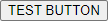

Tip: You can check the default focus indicator styling in Chrome’s developer tools by searching for “: focus-visible” and finding the “user agent stylesheet”.

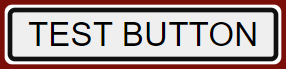
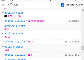
Firefox/Windows
Tip: You can check the default focus indicator styling in Firefox’s developer tools by searching for “: focus-visible”. If you don’t see any matches, there’s a checkbox called “browser styles” that you can check, and the style property “: focus-visible” will appear there, confirming that the style is from the browser (native focus style).
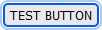
Edge/Windows
Tip: You can check the default focus indicator styling in Edge’s developer tools by searching for “: focus-visible”, which will lead you to the “user agent stylesheet”.
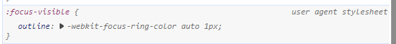
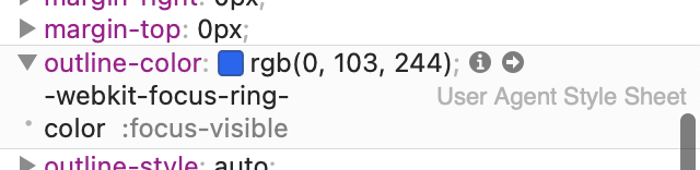
Safari/macOS

Tip: You can check the default focus indicator styling in Safari’s developer tools by searching for “outline-color”, which will lead you to the “user agent style sheet”.
The many, varied focus styles of macOS
Testing on a Mac? Here’s a little trick that you can try that makes it super-easy to tell when you’re looking at a default focus indicator in macOS:
- Go to System Settings
- Select Appearance
- Change the ‘Accent color’ setting (ideally picking a color that is very different from the color scheme of the site you are testing)
That setting will apply your selected accent color to focused elements (unless a custom focus indicator has been defined).
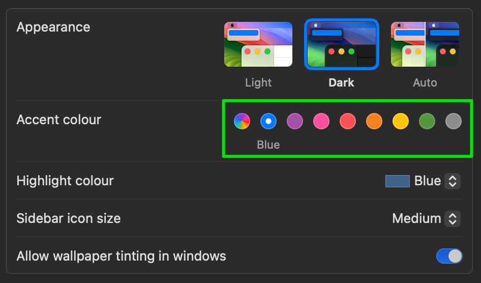
In the settings above, the Blue accent color is selected. The three images below show the default button (nonfocused) alongside buttons with Blue and Green accent colors for comparison:

And this isn’t just a Safari-only feature—changing the accent color works in Chrome and Firefox on macOS too. Here’s how the focus indicator looks in Safari, Chrome and Firefox when the accent color is set to Purple:

Mobile device focus indicators
Mobile devices will show focus indication when a user is navigating with a connected Bluetooth keyboard. How this appears depends on the OS and also whether the element in focus is a native app control or an HTML element inside a WebView.
iOS

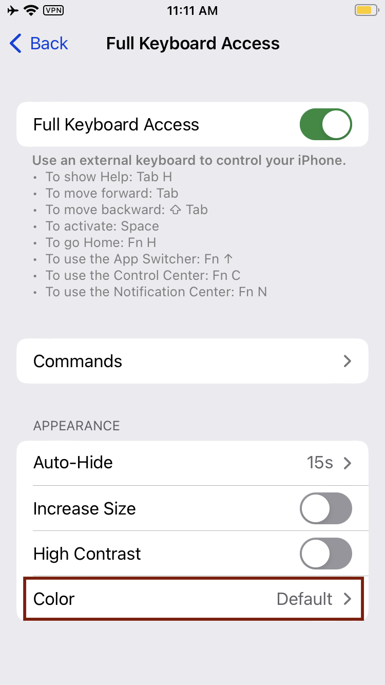
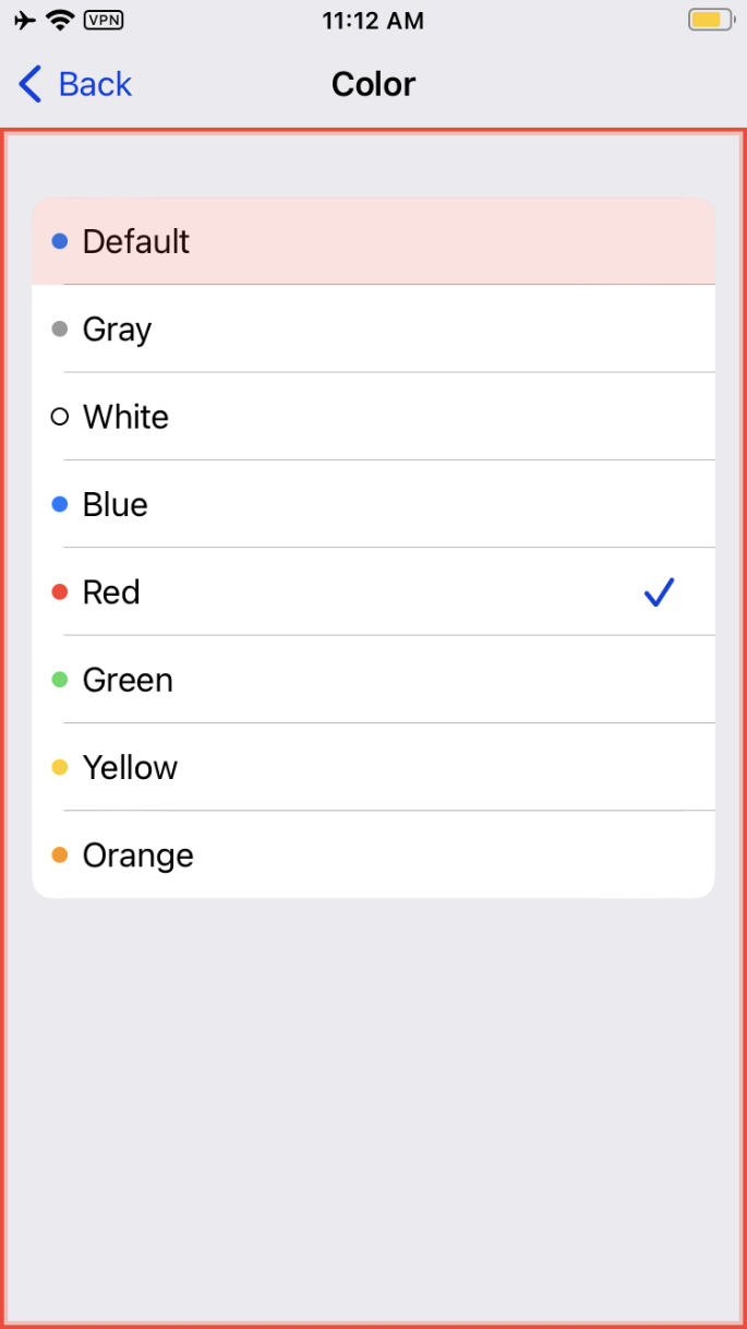
One way to check whether the iOS app that you’re looking at is relying on iOS’s default focus indicator is to compare its colors with the focus indicator’s color when you’re in the Settings app.
Tip: Another way to test this case is by changing iOS’s default focus indicator color in the Settings app (similar to the macOS option to change accent colors). After that change, if you see that color in use for focus indicators, that tells you that you’re looking at the default focus indicator styling. On the other hand, if a given focus indicator’s color doesn’t change, then that’s a custom focus indicator.
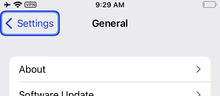
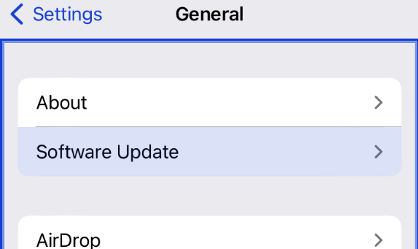
Here are the steps to change the default color:
Settings > Accessibility > Keyboard > Full Keyboard Access > Appearance> Color
Android
One way to know whether your Android app is using the default focus indicator styling is to compare its colors with the focus indicator’s color when you’re accessing the settings of your Android phone.


An important remark for mobile focus indication on Android is that, in most cases, the native focus indicator is a semi-opaque overlaid color tint. It is a subtle change that can be difficult to locate on screen. Given that it is just a color change, does it fail 1.4.1 Use of Color? And what if the color overlay causes text underneath to have lower contrast, does that fail 1.4.3 Contrast (Minimum)? This is what it states in WCAG’s notes about contrast.
NOTE 6
WCAG conformance should be evaluated for color pairs specified in the content that an author would expect to appear adjacent in typical presentation. Authors need not consider unusual presentations, such as color changes made by the user agent, except where caused by authors’ code.
This means that 1.4.1 Use of Color and 1.4.3 Contrast (Minimum) issues generated by the use of such focus indicators are exempted of those criteria. In other words, no failure to report.
Conclusion
Depending on the background color of the page you audit, the color-contrast ratio of the default focus indicators may vary greatly. While browsers’ default focus indicators are technically exempt from 1.4.11 Non-text Contrast since they’re provided by the browser rather than the developer, it’s much better when a site provides focus indicators that have been tested to work across all scenarios (all controls, all pages types, light mode and dark mode). Default focus indicators sometimes don’t have enough contrast because they can’t account for all websites and all apps across all possible user settings. But with the above examples in hand, you should hopefully have an easier time ascertaining when a site is using the browser’s default focus styles.
Resources
- When I Get That Low Contrast Feeling, I Need Non-Textual Healing
- How To Avoid Breaking Web Pages For Keyboard Users
- Understanding SC 1.4.11 Non-text Contrast (Level AA)