
A representation of a broken keyboard experience: a broken piano with missing keys, one leg missing, and looking generally worse for wear.
When we are not considering the experience of keyboard users, we should expect that our websites are significantly more difficult to use for many people with disabilities. Some examples of people who use keyboards to navigate and activate controls are:
- Screen reader users in general.
- Switch device users in general.
- A sighted user who does not need any specialized assistive technology, but cannot use a mouse because they have hand tremors.
- A low vision user that uses both the mouse and keyboard.
- A voice-control user where voice commands are the equivalent to keyboard commands.
Designing for keyboard users is important for all environments such as mobile and desktop apps, but I am focusing this article on web pages specifically.
Two key factors to consider for keyboard users are the predictability of focus management and how perceivable the focus indicator is. These can cause different things to break and I need to talk about these separately so that we can identify the underlying source of broken experiences.
What is focus management?
Focus management is when something receives keyboard focus, such as when navigating to a button using the TAB key. When it’s not handled, some people can become lost on the page, not knowing where they are or where they should be.
Web browsers are exemplary at demonstrating focus management. In many cases, users can get back to a predictable place in the web page through the TAB key. Navigation using arrow keys is additionally built-in to some native form controls, such as <select> elements.
When working with custom functionality like buttons, you will need to decide whether keyboard focus should be moved, and where, so that the user experience is logical and predictable. For example, a button that reveals a modal dialog should move keyboard focus into the modal dialog and constrain focus to the dialog.
What can go wrong with focus management?
Bad focus management is not predictable and is missing information for assistive technologies. Take the following examples:
Scenario A: Controls disappear on activation
Problem
A product page on an e-commerce website has an “Add to cart” control. When this is activated, the control is removed and is replaced with the message “Item added to the cart.”
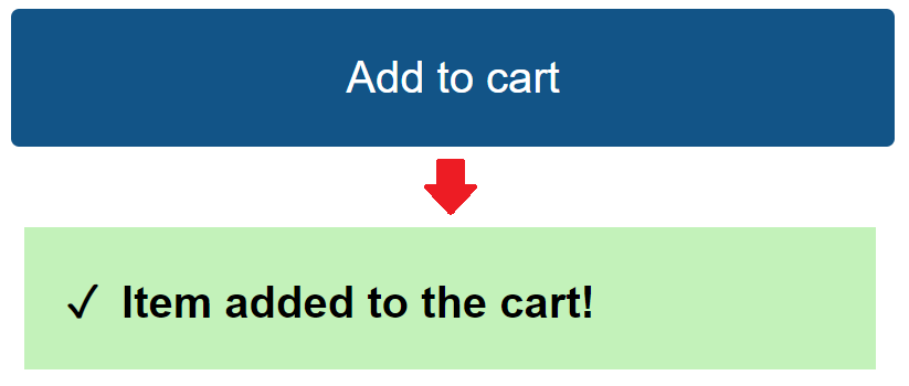
When the control is removed, the browser performs a set of steps that moves focus to the <body> element (which is the default when no element is focused).
However, the experience is still problematic for some assistive technology users.
Screen magnification users could be disoriented. Some screen magnifiers allow an option to turn on focus tracking. In the case above, because focus is moved to the <body> element, screen magnifiers are visually moved to the top-left corner of the page. If there’s nothing in that corner then screen magnification users could become disoriented.
People using the JAWS screen reader for example would receive information about the page title. Additionally, their reading order could be unexpectedly reset to the top of the page. NVDA is better at handling this scenario, but it is still problematic as nothing is announced when the control disappears. Blind and low vision users might have the impression that nothing has been actioned.
Other scenarios that have similar effects:
- When the control is disabled via the
disabledattribute. - When the control is hidden via CSS
display:noneor thehiddenattribute. - When the custom control is made unfocusable by removing the
tabindexattribute.
Solution
When activating a control causes that control to be hidden from the page, ensure that the focus event is set on another predictable location, preferably a control in the same context. If moving the focus event on a non-interactive element, add tabindex="-1" on that element. Do not use tabindex="0" in this scenario to avoid a verbose TAB navigation for keyboard users.
Example acceptance criteria of the “Add to cart” control:
- When a keyboard user adds an item to the cart, they receive information confirming that the item is added through focus management.
- When a keyboard user adds an item to the cart, they can continue navigating on the same page from where they added the item to the cart via the TAB key.
Scenario B: When links lead to content in the same page
Problem
A product page on an e-commerce website contains multiple sections of information, such as “About”, “Specification”, “Reviews”, and “Q & A”. To help users jump to this information, a local navigation is available with the same named links (“About”, “Specification”, etc.). Activating one of these links automatically scrolls the user to that section of information.
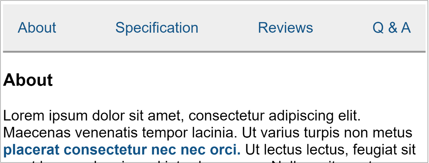
While activating one of these links visually moves the user to that section of information, the focus resets to the <body> element and, just like Scenario A, this can be disruptive for some assistive technology users, as the video below demonstrates.
If your browser doesn’t support embedded videos, you can download it, and import the captions file if you need it. (Apologies if you were unable to access captions on an earlier version of this video.)
Video Transcript
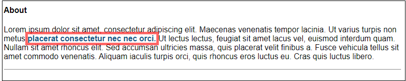
In this scenario we have an inline navigation for a web page that contains four links: “about”, “specification”, “reviews” and “Q & A” and when these links are activated the browser scrolls to the relevant information in the same page. For example, activating the “about” link scrolls to the “about” section of information. One technical aspect to note about this example is that it is not using the tabindex attribute on the linked content.
So, looking at the behaviour of the links here it seems that the navigation is working as intended because when you click on a “about” link it scrolls to the “about” section. Additionally if you were to navigate to the “about” link and activate it using a keyboard you can then press the TAB key and reach content in the section you’ve just scrolled to, so it looks all fine.
What’s the problem here? While it may seem that focus is being managed it really isn’t being managed at all and when focus is not managed some assistive technology users like screen reader users and screen magnifier users have a difficult time finding where they are on a page.
So what’s happening behind the scenes? When you activate the “About” link in this example focus is actually being reset to the body element and that means that focus is being reset to the top of the page. This can be demonstrated by watching the activeElement in the console of your preferred browser.
So I’ll just demonstrate that quickly using Chrome writing an expression called document.activeElement, and when I focus on the “About” link, you can see the activeElement is "a", the anchor tag, and I press ENTER and now the activeElement is "body". That means focus has been reset to the <body> element and it’s not being managed. So what this means for some assistive technology users is: JAWS, for example, people using the JAWS screen reader will unexpectedly hear the page title being announced when they press a link like the “About” link.
Windows screen magnifier, that has focus management turned on, will result in the user moving to a sometimes unexpected, uninformed section of their view, for example being moved into white-space, and I can demonstrate the example of a screen reader screen-magnifier user. So here I’ve turned on Windows screen magnifier, 600% zoom ,and I have turned on focus tracking. Now when I activate the “About” link with the ENTER key, I move to white-space, and essentially I’ve moved to the top-left corner of the page.
Let’s turn this off.
So you’re not using the tabindex attribute results in a problem with focus management. Focus is not being managed, and to resolve this all you need to do is add tabindex to the containing element of the target. So if you’re clicking on the about link you’re going to the “About” section of information. You just add the tabindex to the container of that section of information.
Solution
When activating a link that leads to information on the same page, ensure that the link href matches the ID of the target, and that the target has tabindex="-1".
Example acceptance criteria of the local navigation:
- When a keyboard user activates a link in the local navigation, they can perceive the information that the link leads to.
- When a keyboard user activates a link in the local navigation, they can navigate forwards onto the information that the link leads to, should any controls be available in that information.
Delayed scrolling (or “smooth scrolling”) animations can be problematic for many people with disabilities. For example, keyboard users may press the TAB key quicker than when the animation finishes, causing them to move past the scrolled-to section.
What is a focus indicator?
A focus indicator is the visible indication that something has received keyboard focus. It appears in the user interface so that sighted keyboard users can perceive where they have navigated.
People who benefit from focus indicators could be the same people who benefit from focus management, or they may be keyboard users who do not use assistive technologies, for example:
- People with cognitive disabilities could be using ZoomText to help them follow where they are on the page, such as when navigating to links in a paragraph.
Screenshot of the default red, thick, and translucent focus indicator around a link amongst a paragraph of text from ZoomText. - People with moderate vision zoomed-in 200% may perceive that focus is moved somewhere but cannot pinpoint where. For example, activating a skip link that leads to the main content.
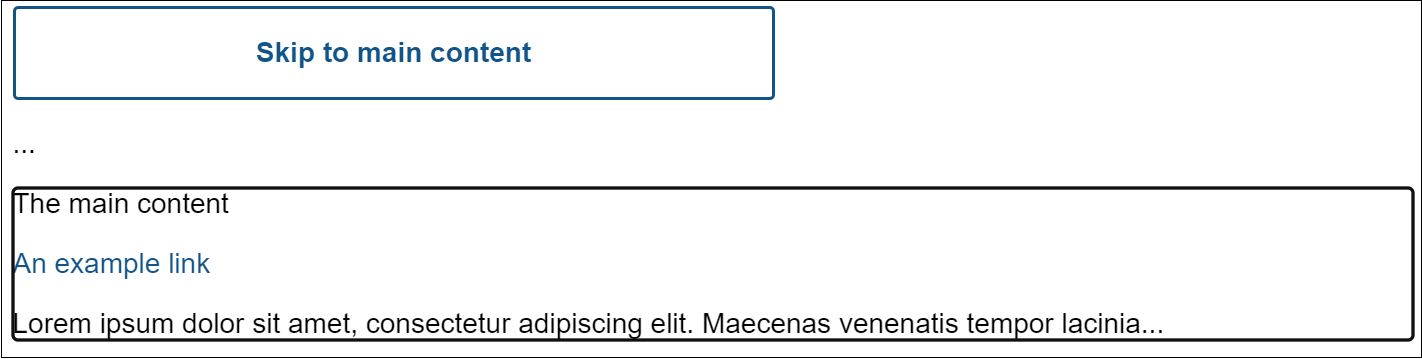
Screenshot of a solid black outline surrounding the main content container when a “Skip to main content” link is activated from Google Chrome and the main content implements tabindex="-1".
What can go wrong with a focus indicator?
A good focus indicator is clearly perceivable, for example it has strong color contrast and uses a thick border surrounding the control. A bad focus indicator is the opposite.
Scenario C: When a control is missing a focus indicator
Problem
A checkout page on an e-commerce website contains a form asking for the delivery address. At the bottom of the page there are two controls next to one another in the order “Cancel” and “Continue.”
By the time a keyboard user reaches these controls, they have carried out the tedious task of filling their address. They do not want to accidentally leave this page and start again.
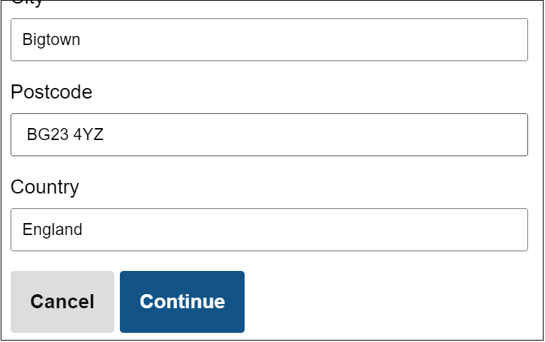
When navigating to the “Cancel” control via the TAB key, there is no indication that the control has received focus. The user is unsure whether they have reached the “Cancel” control at all. Pressing the TAB key again to reach the “Continue” control results in the same issue. There is no indication that the “Continue” control has received keyboard focus. A mistake here and a lot of progress could be lost.
Solution
Ensure that focused controls are given highly visible focus indicators.
The appearance of the focus indicator is up to you as the web author, but it must be perceivable. If you stick to a solid design that is undisputedly clear, you might save yourself a headache trying to interpret multiple WCAG criteria around this. In other words, do not implement a light border that cannot be easily distinguished against the control it surrounds
Example acceptance criteria of the “Cancel” and “Continue” controls:
- A keyboard user deciding to cancel their checkout journey can navigate to, identify the control when navigated, and activate the control.
- A keyboard user deciding to continue their checkout journey can navigate to, identify the control when navigated, and activate the control.
Are keyboard users covered by WCAG?
Yes, WCAG contains success criteria that helps keep focus management predictable and focus indicators perceivable. These include:
- 2.4.3 Focus Order (A) [WCAG 2.1]
- 2.4.7 Focus Visible (AA) [WCAG 2.1]
- 2.4.11 Focus Not Obscured (Minimum) (AA) [WCAG 2.2]
- 2.4.12 Focus Not Obscured (Enhanced) (AAA) [WCAG 2.2]
- 2.4.13 Focus Appearance (AAA) [WCAG 2.2]
These criteria are essential to designing a good keyboard user experience. I encourage everyone to read the Understanding documents available in the above criteria, for example: Understanding SC 2.4.3: Focus Order.
Conclusion
Now that you have some ideas on what breaks the keyboard user experience and how these can be fixed you can bring this knowledge into the design and development process and make your content more accessible to keyboard users.