Website authors can help meet the needs of people with low vision, with or without screen magnification software, by testing web content against WCAG Success Criterion Reflow 1.4.10. Although this success criterion is intended for many interfaces such as apps, I’ll focus here on websites as an example.
People using screen magnification software may experience problems when navigating a website. Part of that is down to the magnification software itself, but part of it is how content flows on the website.
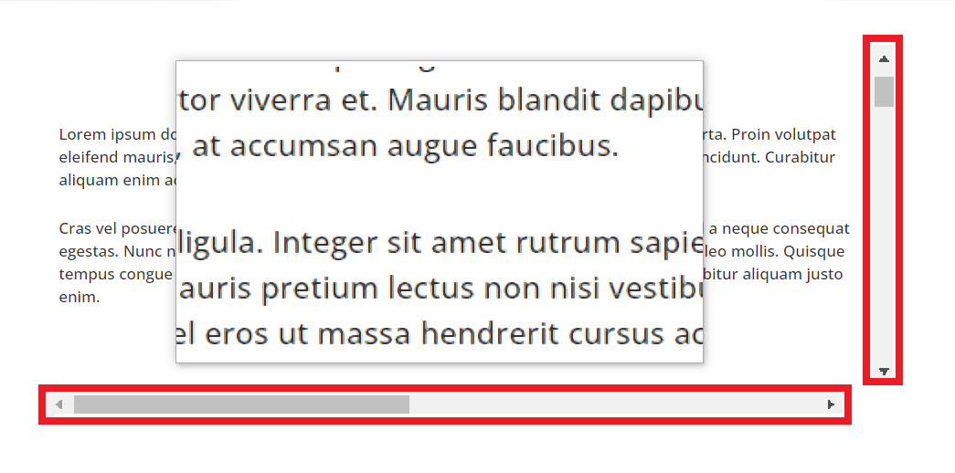
Content should wrap onto new lines so that it always fits in the browser window. This is called content that ‘reflows.’ When content doesn’t reflow, it typically overflows the page, requiring an added scrollbar to become visible. A website that has both vertical and horizontal scrollbars requires more effort and the larger the screen magnification, the more serious the problem.
How Am I Affected?
As a user of magnification software, when a website doesn’t support reflow, I can’t perceive the left and right sides of the web page at one time. In that case, I must move my mouse pointer to the left, right, top, and bottom to explore the interface, read information, and mentally map how portions of content fit together as a page. The extra movement of my mouse pointer, concentration needed to follow lines of text, and cognitive burden can be exhausting. Sometimes I miss content entirely, as I don’t know it even exists outside of my view.
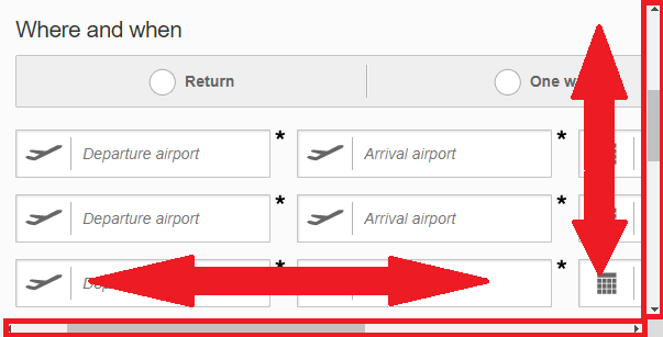
When a website supports reflow, I can set the size of my browser window to match the size of my screen magnification. For instance, a 200% magnification on my 1280-pixel wide laptop halves my view into 640 pixels. Resizing the browser to 640 pixels wide means I can see the left and right sides of a web page at any one time. As a result, I only need to move my mouse pointer up and down to view other parts of the page. This also helps me familiarize myself with content on the web page, reducing the risk that I’ll miss something altogether.

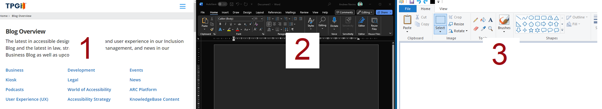
In general, I use multiple virtual desktops with each desktop serving one application that is sized within my screen magnification view. For example, to perform a website audit I have 3 desktops, one for reviewing the website, another for writing results, and a third for creating screenshots. With this setup, I can easily switch between tasks without having to readjust sizes of applications. I can even switch via keyboard shortcuts for efficiency.
When Does Success Criterion 1.4.10 Reflow Apply?
This success criterion is intended for people viewing websites on 320- or 256-pixels wide browsers. More specifically, a width equivalent to 320 CSS pixels for vertical scrolling content or 256 CSS pixels for horizontal scrolling content. Take the following example from Wayne E. Dick, 2017:
A 1280 CSS pixel web page does not support reflow and contains 48 lines of text. At this size, people with full vision need 1 vertical scroll to read the text. Whereas at 400% magnification, people with low vision require 68 scrolls to read that same text because of horizontal scrolling. With the help of success criterion 1.4.10 Reflow, people with low vision would require 9 scrolls to read the text in that example.
The Difference Between Browser Resizing, Browser Zoom, and Screen Magnification
People with moderate-to-low vision may use browser resizing, browser zoom, screen magnification, or a combination of all three to read and navigate a web page.
Browser Resizing
Browser resizing is where people adjust the size of their browser window. If a website supports reflow, resizing the browser helps magnification users view the boundaries of a web page in their magnification.
In general, I take advantage of browser resizing because it’s easier than browser zoom. Zoom settings are not always remembered by browsers, which burdens me to manually zoom in to multiple websites. Additionally, zooming requires 5 keystrokes of CTRL + PLUS, whereas resizing the browser requires 1 via ALT OPT + LEFT ARROW. This divides the browser into half my window, immediately matching my 200% magnification.
Browser Zoom
Browser zoom allows users to magnify text using controls available from the browser, such as through CTRL + PLUS keys. While this helps enlarge text, it increases the number of scrolls if a web page does not support reflow.
Sometimes, I use browser zoom alongside screen magnification on a web page when certain text is too small, such as when it is presented in narrow columns.
Why wouldn’t I just increase my magnification? Changing screen magnification is like wearing a strong pair of glasses. While you may see things clearer, it takes some time getting used to. Increasing magnification also means more scrolling.
Screen Magnification
Screen magnification is activated from the operating system, for example via Windows Screen Magnifier. Think of it like holding a magnifying glass over your screen. Screen magnification may perform better than browser zoom alone, achieving magnifications of 700%.
The Solution?
To help a wider range of people with moderate to low vision, avoid having both horizontal and vertical scrolling at all breakpoints on a web page. While meeting success criterion 1.4.10 Reflow is good, it doesn’t help people viewing webpages in other screen sizes (like myself at 640 pixels).
If that isn’t possible, consider adding controls that, when activated, move content into view so that people don’t have to pan around for it. An example of this is a carousel with “Previous slide” and “Next slide” navigational controls.
If you build web pages according to the principle of responsive web design, reflow should happen automatically as the size of the viewport changes. However you do it, make sure that your content reflows rather than overflows.
Further reading
Operational Overhead Caused by Horizontal Scrolling Text (Wayne E. Dick)
Comments
Thanks, Andrew! Always looking for more clarification and insights on this issue and you explain it very well.