This is an article pulled from KnowledgeBase, a digital accessibility repository available through TPGi’s ARC Platform. KnowledgeBase is maintained and consistently updated by our experts, and can be accessed by anyone with an ARC Platform subscription. Contact us to learn more about KnowledgeBase or the ARC Platform.
Data visualization is a term applied to images that are used to make complex data easier to understand by displaying them visually.
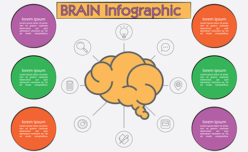
Examples commonly encountered in web content include pie charts, line charts, column graphs, bar graphs, and infographics (where illustrations and embedded text are combined in a single image to convey detailed information).
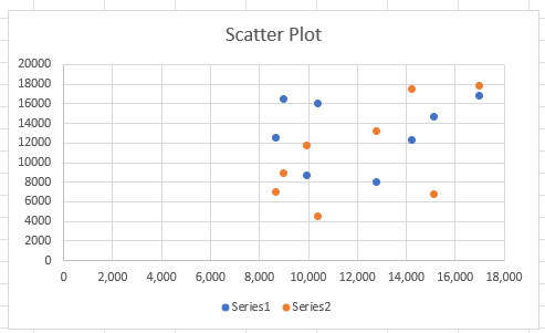
Less commonly encountered examples include illustrated timelines, venn diagrams, heat maps, scatter plots (a chart with dots representing data points scattered across an x and a y axis), treemaps (hierarchical data shown in nested rectangles), and data pyramids (where grouped data is shown as proportionally sized slices of a triangle).
What they all have in common is that information, often drawn from a spreadsheet or data table, is presented visually to not only represent data but to illustrate relationships between the data.
While their aim is to make information easier to understand, data visualizations can have specific accessibility implications for people with disabilities.
Text alternatives
Like all images, data visualizations must conform to the requirements of WCAG that their meaning is made available programmatically to users of assistive technology like screen readers. Specifically Success Criterion 1.1.1 Non-text Content (Level A) says:
All non-text content that is presented to the user has a text alternative that serves the equivalent purpose […]
Typically this means supplying information about a meaningful image as text in an alt attribute, as a caption, or in surrounding text. However, because of their particular nature, data visualizations may require text alternatives that differ in approach to more basic images.
Alt text, a caption, or surrounding text that says, for example, "a pie chart showing the proportions of revenue earned by each department" does not serve an equivalent purpose. because the information conveyed by content that is shown is not described. What is required is to convey the same information as the visual image in a non-visual way, which means not just the data but also the relationships between the data.
A rule of thumb for writing alt text for data visualizations is alt="[type of data viz] of [data] that shows [what the data shows]".
For example:
alt="a pie chart of revenue by department that shows Federal Sales produced 30% of all revenue, 12% more than State Sales, with Local Sales producing the least revenue at 6%, of a total of $2.2 million"
or:
alt="an infographic that shows the relevance of the seven deadly sins to teenagers in a rating out of 10: Lust 9/10, Gluttony 7/10, Greed 7/10, Sloth 8/10, Wrath 6/10, Envy 8/10, Pride 6/10"
Clearly, the more complex and detailed an image is, the longer the alt text will tend to be. It's a matter of judgment to find the balance between providing enough detail in text without overwhelming (or boring) the screen reader user.
Alternative text should focus on what the data visualization conveys within the context of the surrounding web content. If the point of including a graph is to show that, for example, the population of a locality jumped unexpectedly in a period and then settled down again, let the alt text reflect that rather than just listing all the data points in the graph.
If the information and relationships conveyed by the image can't be summarized briefly enough to form concise alt text, it may be appropriate to link to a long description in text somewhere on the same page, in a disclosure widget located near the data visualization, or on another web page.
These techniques can also be used to present the data in tabular format if that's appropriate, semantically marked up to be accessible. In both cases, make sure there's a way for the user to return to where they were. Be aware that in some cases, just presenting the data in tabular format will not be enough. It may require adding text that explains what the data shows and draws attention to key points.
You can find examples of these techniques, including code samples, on the WAI tutorial page on Complex Images.
longdesc property to an <img> element to link to a long-form description of the image. The longdesc property has been deprecated and should not be used, despite most browsers currently continuing to support it.
Color alone
Charts, graphs and other data visualizations may use color to visually distinguish one segment of data from another. This presents problems for people with various types of color vision deficiencies who may not be able to distinguish between the colors used.
WCAG Success Criterion 1.4.1 Use of Color (Level A) requires that:
Color is not used as the only visual means of conveying information, indicating an action, prompting a response, or distinguishing a visual element.
This does not mean that color can't be used to distinguish information in data visualizations, it means there must be some non-color based way, as well. For example, a bar chart could use different types of fill patterns to distinguish the bars as well as color, perhaps vertical stripes, horizontal stripes, diagonal stripes, cross-hatching, etc. If a guide to what the colors mean is provided – typically in a caption – make sure they also include the type of fill used.
Text labelling can also be used, for example underneath the bars on a bar chart, within the segments of a pie chart, or adjacent to the lines in a line graph. In many cases, labelling data directly within the image lightens the cognitive load compared to using chart legends that require reference back and forth between the legend and the image.
Color contrast
Having insufficient color contrast ratios between segments of a data visualization or against their surrounding background can also create problems.
WCAG Success Criterion 1.4.11 Non-text Contrast (Level AA) states:
The visual presentation of the following have a contrast ratio of at least 3:1 against adjacent color(s):
User Interface Components
Visual information required to identify user interface components and states, except for inactive components or where the appearance of the component is determined by the user agent and not modified by the author;Graphical Objects
Parts of graphics required to understand the content, except when a particular presentation of graphics is essential to the information being conveyed.
Use the Colour Contrast Analyser to establish the contrast ratios and identify instances where color contrast is insufficient, then suggest color combinations that meet contrast requirements. In cases, such as bar charts where the bars are immediately adjacent, separating them with some white space might making it easier to conform, as each bar only has to meet contrast requirements with its background, not the adjacent bars. Similarly adjacent segments of a pie chat can have a border applied with a sufficient contrast.
Keyboard accessibility
Data visualizations often incorporate a certain level of user interactivity, such as hovering over a data point for additional information via a tooltip, or linking from a data point to its source. This level of interactivity must be made available to people who use only a keyboard to access web content.
WCAG Success Criterion 2.1.1 Keyboard (Level A) says:
All functionality of the content is operable through a keyboard interface without requiring specific timings for individual keystrokes, except where the underlying function requires input that depends on the path of the user's movement and not just the endpoints.
Users should be able to TAB into elements containing data visualizations (in many cases, adding tabindex="0" will help), and use arrow keys to move between elements within the data visualization. Interactive elements within the data visualization should also be accessible by TAB.
A point to bear in mind is that data visualization is often used to allow users to compare different data points at a glance, whereas keyboard access is typically provided sequentially. Just enabling users to move through the different data points in a chart or graph may not adequately convey that comparison functionality. In that case, text may be required to make the comparison clear.
Best practice
Apart from WCAG requirements, there are a few techniques that can (and should) be used to make data visualizations usable for people with disabilities.
Use semantic HTML to give each data visualization a heading or title that describes the content, as well some introductory text that tells the user what the purpose of the visualization is.
<figure>
<h3>Site visitors, first quarter 2014</h3>
<p>A graphic comparison of site visitors in January, February and March across our three websites.</p>
  <img src="bar-graph.png" alt="Bar graph showing monthly and total visitors for the first quarter 2014 for sites 1 to 3, description in link below.">
  <figcaption>
    <a href="2014-Q1.html">Full text description of the Site visitors, first quarter 2014 bar graph</a>
  </figcaption>
</figure>
When you use text in data visualizations, whether it's actual text or text embedded in an image (as is often the case in infographics), use clear fonts, large font sizes, adequate spacing and line height, and short paragraphs in plain language to make the text easy to read.
Conclusion
Not every technique suggested here will be appropriate for data visualization, and some techniques may need to be used in combination to conform to WCAG requirements. The idea is not to defeat the purpose of presenting complex data visually but to ensure the same data and informational relationships are conveyed to all users.
Data visualizations can be extremely useful and effective in conveying and explaining complex data. Like all web content, they just need to be implemented thoughtfully and accessibly.
Resources
- Understanding SC 1.1.1: Non-text Content (Level A)
- Understanding SC 1.4.1: Use of Color (Level A)
- Understanding SC 1.4.11: Non-text Contrast (Level AA)
- Understanding SC 2.1.1: Keyboard (Level A)
- WAI Tutorials: Complex Images
- An intro to designing accessible data visualizations, Sarah L. Fossheim
- Accessibility Considerations In Data Visualization Design
- Material Design: Top Tips for Data Accessibility
- Highcharts for Accessibility
Comments
If data are available in a tabular format, can I forget the keyboard support when hovering data points?
If the table is keyboard accessible and there is information to convey the data relationships, then that’s sufficient as an alternative.