
“Asterisk” (CC BY 2.0) by Steve Snodgrass
When filling in a form—be it signing up for a newsletter or applying for a credit card—you must provide a minimum amount of information for the form to function. A newsletter sign-up form may only need your email address, whereas a credit card application will typically require much more information. Input fields that collect this essential information are known as mandatory or required fields: information you need to provide for the form to function.
It is important to make users aware of required fields upfront. This should prevent them from making submission errors and having to backtrack through a form to fix such errors. But what is the best and most accessible way to indicate required fields? This article aims to explain exactly what’s required.
Relevant WCAG Success Criteria
WCAG touches upon required fields in only a single success criterion:
- 3.3.2 Labels or Instructions Labels or instructions are provided when content requires user input. (Level A)
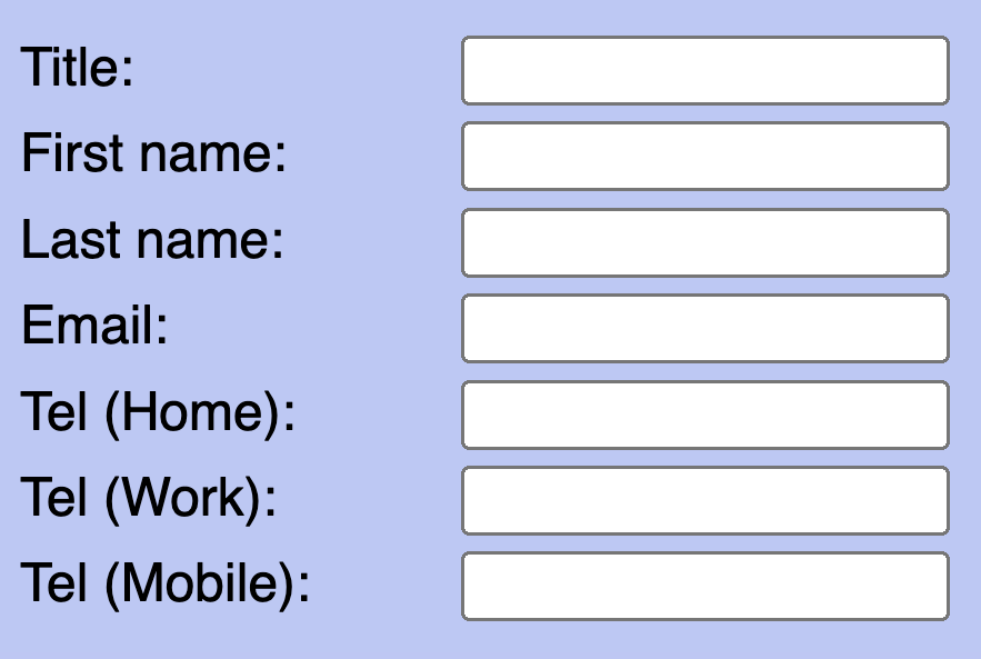
Indicating REQUIRED fields
The most unambiguous way to indicate information that users need to provide is to include the text “required” or “mandatory” in the form field’s visible text label.

<label for="email">Email (required)</label>
<input type="text" id="email" name="email">
For a more streamlined interface, you might instead rely on the convention of indicating required fields with a (typically red) asterisk in the form field’s visible text label.

<label for="email">Email*</label>
<input type="text" id="email" name="email">
This is a well-established and widely understood convention but it’s still good practice to include a note at the beginning of the form to explain that asterisks denote required fields. Yet with or without such an explanation, asterisks provide a very visual solution and can be less meaningful to screen reader users, who must listen out for the ambiguous word “star” (assuming that their screen reader is configured to announce punctuation marks and typographic symbols in the first place). Also, screen readers don’t necessarily announce a form field’s associated label when they reach it (it is announced if you Tab to it, but not if you reach it with the virtual cursor).
A more robust solution is to programmatically expose required form fields using the aria-required or required attribute. Doing so will result in screen readers explicitly announcing such form fields as “required”. This also provides a programmatic hook for Braille output, which can then abbreviate state information (e.g., “req” for “required”) to reduce verbosity and exploit the limited character space of a Braille display.
Of course, if you’ve already included the word “required” in the visible text label, this will result in screen readers repeating it twice, but this is, arguably, a small price to pay. You could always avoid this repetition by hiding the visible “required” text from assistive technologies with an aria-hidden attribute.

<label for="email">Email <span aria-hidden="true">(required)</span></label>
<input type="text" aria-required="true" id="email" name="email">
Indicating OPTIONAL fields
Whichever approach you use, a form with a large number of required fields could easily become cluttered with repetitious indicators. Where this is the case, an increasingly common approach is to indicate only the optional fields, typically by including the text “optional” in the form field’s visible text label. Users must then infer that any fields not marked as optional are required.

<label for="name">Name (optional)</label>
<label for="email">Email</label>
Several UX researchers have considered the merits of indicating only optional fields. For example, Raluca Budiu of the Nielsen Norman Group argues in their 2019 article, Marking Required Fields in Forms, that only indicating optional fields adds to cognitive load as users must deduce which fields are required. Instead, they recommend explicitly indicating required fields with either an asterisk or the text “required”. But there’s no need to go overboard: marking optional fields in addition to marking required fields, they suggest, is a nice bonus but not essential.
Using an asterisk to mark required fields is an easy way to improve the usability of your forms. Only marking optional fields makes it difficult for people to fill out the form.
Source: Marking Required Fields in Forms
Edward Scott of the Baymard Institute, published an article in 2018 called E-Commerce Checkouts Need to Mark Both Required Fields and Optional Fields Explicitly (Only 14% Do So). As its title suggests, this article does recommend indicating both required and optional fields. Indicating required fields only, Scott claims, is just as taxing as indicating optional fields only.
“Indeed, it may be tempting to reduce the visual noise in a form by only marking optional fields (or vice versa). However, when encountering forms where only the optional fields were marked, 32% of users during testing had a validation error because they did not complete a required field.
Users simply have no way to “intuitively know” a particular site’s information requirements beforehand. They need to figure it out on a site-by-site basis for each and every form they fill out. This is why it’s necessary to indicate which fields are required and which aren’t — so users don’t have to deduce it themselves.”
Source: E-Commerce Checkouts Need to Mark Both Required Fields and Optional Fields Explicitly
While only indicating optional fields may have the drawback of increasing cognitive load and potentially turning away users, it does not represent a WCAG failure. Understanding Success Criterion 3.3.2 Labels or Instructions, which intends to have authors identify a form’s controls so that users know what data is expected, even cites an example which states: “In a form which contains both required and optional fields, the required fields and/or the optional fields are clearly labeled as such.”
The problem arises when a form contains only required fields.
This requires everything
When all fields are required, and you’ve chosen to only indicate those that are optional, there is nothing upfront to indicate whether the fields are required or not. Users encountering such a form for the first time may struggle to determine which fields they must complete, and which fields they can skip. There’s also nothing to prevent users from submitting an incomplete form.
When only required fields are present, the approach of indicating only the optional fields does not meet WCAG. Due to the ambiguity over the required fields, and the extra effort involved in having to remedy submission errors, this represents a failure of WCAG success criterion 3.3.2 Labels or Instructions. In such situations, we recommend explicitly indicating required fields using the methods described above. Alternatively, you could include a blanket instruction at the top of the form stating that “All fields are required”, but use this approach with caution as research suggests users often ignore or forget such instructions.
Context is key
Of course, there may be situations where it is clear enough from the context that all fields are required. For instance, a simple login form with only username and password fields or a search engine homepage with only a single search field. In such cases, there is arguably no need to explicitly indicate the required fields. Doing so may even confuse people, if the entire purpose of the form is optional (such as signing up for an email newsletter).

Yet still, providing a clarification in such situations will not harm and may still benefit certain users. The Making Content Usable for People with Cognitive and Learning Disabilities document published by the W3C’s Cognitive and Learning Disabilities Accessibility Task Force recommends clearly indicating required fields. This makes the process of filling in a form much easier for people with cognitive and learning difficulties and ultimately benefits everyone.
Error prevention is better than cure
It’s important that all users are made aware of required fields as they are filling in a form. The simplest and safest approach is to visibly label that a field is required as well as communicate it programmatically. This prevents users from making incomplete or incorrect form submissions. It also avoids users having to navigate a page or form again to fix submission errors. Indicate only the optional fields at your peril, and if only required fields are present, you must let users know.
To recap:
- Where a form includes a mixture of required and optional fields, use one of the following:
- Visibly indicate the required fields only, typically with an asterisk or the word “required” in the label.
- Visibly indicate the optional fields only, typically with the word “optional” in the label.
- Visibly indicate both the required and optional fields.
- Where a form includes only required fields, you must visibly mark the required fields or include an instruction stating that all fields are required.
- In all cases, programmatically expose required form fields using the aria-required or required attribute.