
Tabs on iOS and Android
You probably interact with tabs daily if you have a mobile device. They are a very handy way of using a small amount of space to quickly jump to different sections of an application. This article is the first in a series of three articles detailing how to build accessible tabs, each using different mobile frameworks. We will be starting with native iOS and Android with the word “native” referring to the default frameworks used to build apps listed on the Apple Development Documentation (UIKit) and the Android Development Documentation. We are choosing UIKit for iOS because some of the frameworks we will be mentioning in later articles use that as a base framework for building the app for iOS.
While the interactions of tabs in iOS and Android are very similar, the implementation is very different. However, that is to be expected since we are comparing apples to oranges. Or is it Apple to Android?
First let’s break down what VoiceOver and TalkBack announces for tab controls. Those of you who are familiar with the web design pattern for tabs, keep in mind that iOS and Android handle things a little differently and it’s up to each respective platform to establish their own overarching design patterns that fit within their APIs.
First, let’s establish a baseline of tabs. They can be easily found in each platform’s app store assuming your Android device has access to Google Play Services. So, we can take a look at the bottom of the Apple App Store and the bottom of the Google Play Store to find the tab controls. We’ll dive into iOS first.
Tabs on iOS
Now that we know where to look for tab controls as reference. Let’s break down what VoiceOver announces for a tab and what properties in the API causes the announcement. Since we can’t really dive down into the accessibility tree of an iOS app, we will speculate where announcements come from, to a certain extent.
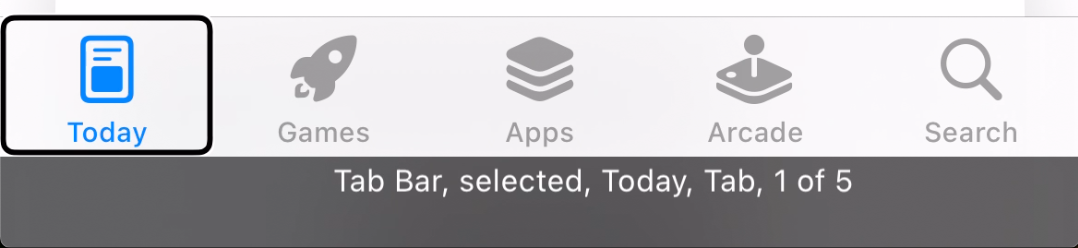
VoiceOver announces the following when tabs are focused:
- Tab Bar: This is only announced once when focus enters the tab bar. This might come from the tabBar accessibility trait and other logic that I don’t know about. I was unable to recreate it using traits alone. It might rely on using a
UITabBarview instead of just a generic view. However, I just consider it a nice-to-have and not required. - selected: This is only announced if the tab is the currently selected tab. It doesn’t announce anything if the tab is not selected. It comes from the
selectedaccessibility trait. - Today: This is the accessible name of the tab that either comes from the text of the child views or from the
accessibilityLabelproperty. - Tab: This is the role of the control. Under the hood, the announcement happens based on some logic. First, the tab itself must have the button accessibility trait. Second, the parent or container view must have
isAccessibilityElementproperty set tofalseand have thetabBaraccessibility trait. If these conditions are satisfied, then it will announce the control as “Tab”. The XCode Accessibility Inspector will list Tab as a trait, but that’s not actually a trait that is documented. It may come from the UITabItem class similar to the issue with the “Tab Bar” announcement. I was unable to recreate this trait using generic views. VoiceOver still announces it as a tab; it just doesn’t show as a trait with the inspector. - 1 of 5: This is the position of the tab in the tab bar. It also lets the user know how many tabs exist. This announcement happens automatically without any additional traits or properties. It most likely comes from an analysis of the tab bar parent and children. As a developer, you do not have to do anything to provide this information.
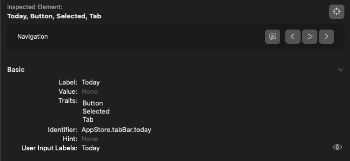
Since the setup of a tab control is pretty specific, it’s unlikely that you’ll encounter any correctly implemented tab controls that announce properties differently or in a different order. We can take a look at the Xcode Accessibility Inspector to view all of these properties. For the “Today” tab in the selected state, the properties are:
- Label: Today
- Value: None
- Traits: Button, Selected, Tab
- Identifier: AppStore.tabBar.today
- Hint: None
- User Input Labels: Today
Tabs on Android
Let’s jump over to Android. If you look on the Google Play Store, there are tabs at the bottom of the screen like the App Store on iOS. Being Android and having a completely open accessibility API, we can tell exact where each announcement comes from if you have the right tools such as an accessibility tree inspector.
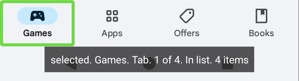
TalkBack announces the following:
- selected: This is only announced for the currently selected tab. The announcement comes from the
setSelected(true)method ofAccessibilityNodeInfofor the view. - Games: This is the accessible name of the control. It can come from either the
contentDescriptionproperty, or from the text orcontentDescriptionof the child views. In this case it is coming from the text on the “Games”TextView. - Tab: This is the role of the control. It comes from the
setRoleDescription("Tab")method ofAccessibilityNodeInfoCompatfor the view. - 1 of 4: This is the position of the tab in the tab bar. The announcement is coming from the
CollectionItemInfofor the view. Like most other announcements, it is part of theAccessibilityNodeInfofor the view.CollectionItemInfocontains the information related to where the view falls in a list or table/grid. - In list: This is only announced once when TalkBack enters the tab bar. The announcement can be triggered in a few different scenarios such as a ListView or a view that inherits from the AbsListView class. Another scenario (which this one is using) is the use of
CollectionInfowithinAccessibilityNodeInfo.CollectionInfois the parent counterpart toCollectionItemInfo. It contains information about the group such as how many rows and columns. In this case, it is essentially a single column table which is also just a list. - 4 items: This is another one that is only announced once when TalkBack enters the tab bar. It comes from the
CollectionInfowithinAccessibilityNodeInfo
Keep in mind that the order of these announcements can depend on how the children views are arranged. In this case, the view that TalkBack focuses on is a View that has the setSelected property and the CollectionItemInfo. The view with the accessibilityRoleDescription of “Tab” is a child, and the View with “Games” text is another child view. The screenshot below shows the view hierarchy with the properties. The parenthesis around “Tab” just indicates that the view has “Tab” as the value of the accessibilityRoleDescription which forces TalkBack to override the role based on the view class and announce whatever text you tell it. In this case it is just a generic View which wouldn’t warrant an announcement of a role from TalkBack.
The accessibility values are:
- View
- Collection Info: Rows 1, Columns: 4
- Actions: a11y focus
- Size: 1080 x 168 px
- Children:
- View
- Collection Item Info: Row: 0, Column: 0
- Actions: focus, clear a11y focus
- Properties: focusable, screen reader focusable, selected, accessibility focused
- Size: 270 x 168 px
- Children:
- ghm
- Actions: a11y focus
- Size: 63 x 63 px
- Visibility: invisible
- TextView
- Text: Games
- Actions: a11y focus
- Size: 105 x 42 px
- View (Tab)
- Actions: a11y focus
- Size: 270 x 168 px
- ghm
- View
What’s next?
So now you have a better idea of what goes on behind the scenes to make an accessible tab control for iOS and Android. While the APIs are very different, the interactions are very similar.
This probably feels like an information dump, and it pretty much is. I did it for a good reason though! Tomorrow we will put this knowledge to use to build accessible tab controls in React Native which is one of the popular frameworks that allows for the development of iOS and Android with a single code base.