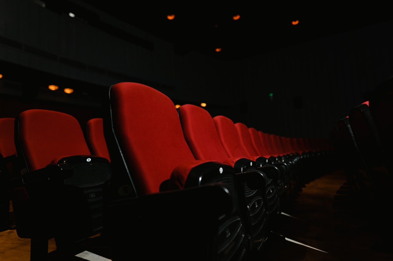
You walk into a movie theater. The lights are dimmed, and you hear previews playing. What was your seat number again? You take out your phone to check your ticket: 8G. Cool—now where is 8G? Is G the row number or the seat number? Is it on the side that I walked in from, or do I need to go to another aisle?
Sometimes we take for granted the tools that we have at our disposal when exploring physical spaces. What happens when those tools are removed? If you’re sighted, think about walking through that same movie theater with your eyes closed: could you still find your seat? Navigating our surroundings is something we do every day, but that doesn’t mean that we all do it the same way.
How people explore a physical space
People who are blind, deafblind, or who have low vision rely on tools to help them navigate environments. They may use things like red or white canes or guide dogs to avoid obstacles while walking around. If they can hear, they may also listen to sound cues to orient themselves. It’s important to remember that everyone is different, and the way that we move around is no exception. Necessity, preferences, our environments, and our lived experiences all affect how we explore.
Physical spaces on the web
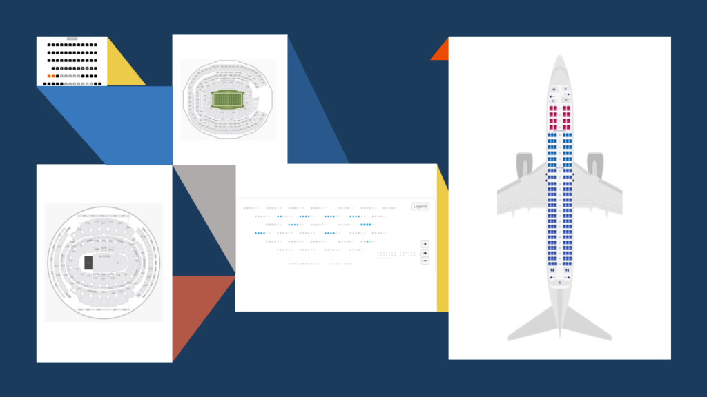
What does this have to do with web accessibility? Well, it’s common for physical spaces to be represented online. Have you ever booked a flight or purchased a ticket to a movie or play? If so, you probably got to a step where you had to pick your seat. And that process involved reviewing a seating chart of the plane or theater. This is one of many ways that we experience digital representations of real-world locations. And as with anything on the web, there’s a good chance that they’re created without having given consideration to people with disabilities.
To focus the discussion a bit, from here on I’m going to run with the example of a theater’s seating chart.
How do you decide which seat you want? When I go to the theater, I like to sit toward the center, and I prefer the mezzanine section rather than the orchestra section. Since I can see the theater’s seating chart, it’s a fairly easy process for me to find an available seat in the section I want. And since I can use a mouse, I can click on the seat that I want once I find it. Then, when I get to the theater, I know where I should go in and where to find my seat. But not everyone on the web is like me, and that same experience can be surprisingly difficult if you use keyboard input or a screen reader.
Consider why websites offer seating charts. Ticketholders could hypothetically complete the same task by picking a seat number from one long list, but then they’d lose so much context. They wouldn’t know what section it’s in. They wouldn’t know whether it’s near an aisle. They wouldn’t know whether they were near an emergency exit or something potentially distracting like a sound booth. These factors and more affect our decisions, so all of that information should be made available to users. That information should translate into the digital representation of that space.
Things to consider if you’re building a seat-selection widget
In preparation for this article, I spoke with a few screen-reader users and asked them about the things that make physical spaces easy or hard to navigate. Granted, this was a very small sample size. But even so, there were a few factors that were consistent:
- Familiarity with the space
- Number of obstacles or turns
- Useful landmarks
Familiarity
This is the best reason for offering seating charts: So that customers can gain a baseline familiarity with the space before they go there. They help theatergoers make informed decisions about which seat to buy and a general idea of where to go when they actually get there. The more familiar a person is with a space, the easier it’ll be for them to navigate. That applies whether they can see or whether they’re aided by a guide dog.
So theater owners should make the most out of those charts. They should provide as much context about the location as possible so that ticketholders can become more familiar with it. They should help their customers build a mental model of what the space is like.
Obstacles
While I may prefer the center mezzanine, others may prefer seats that are easier to get to (or to get out from when that extra-large Cherry Coke starts to kick in). People can really benefit from knowing things like:
- Does it take a thousand turns to get to their seat?
- Is the seat squeezed behind a giant pillar that could make it harder to see or hear?
- Do they have to take stairs or an elevator to get there?
- Is there space for a guide dog to sit?
Landmarks
Not to be confused with ARIA landmark roles, here I’m talking about objects or locations that people can use to orient themselves. If there are key places that people can identify and use to help them find their way, point them out.
- Where’s my seat relative to the stage?
- Where’s the theater entrance? “The entrance is just past the concession stand on the left.”
- Where is the closest restroom? (Again, that Cherry Coke is going to hit me at a very inconvenient time.)
Putting it all together
You have all these concepts, but how can you apply them? Well, let’s make an example of one of these interactive seating charts and apply these concepts.
To start out, I’m going to use an <svg> element to draw us a pretty picture. You could also do this with HTML elements and CSS. But I found enough examples using SVGs when researching this topic, so I’m going to take that approach. It also seems like a lot of people don’t know that you can make interactive SVGs accessible, so we’ll feed two birds with one scone with this example. I’m not going to detail every decision that I made when I built the final prototype, but I’ll try to hit on some of the major points.
<svg role="application" aria-label="Choose your seats">...</svg>
Screen reader considerations
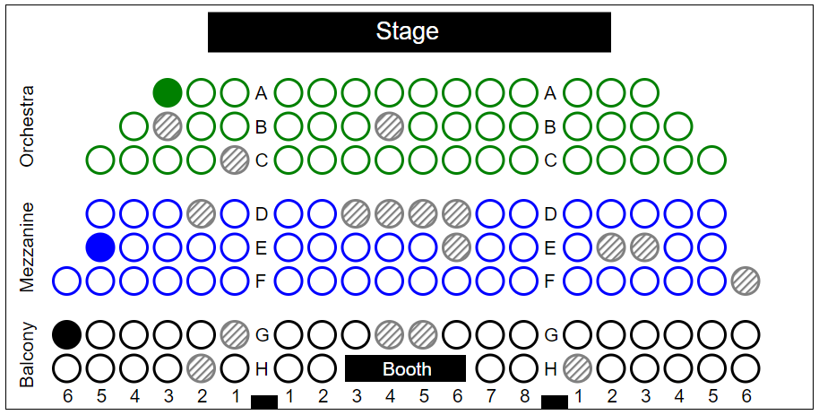
Shapes in the SVG represent different objects in the theater. There’s a stage at the front, doors at the back, and so on. Each seat is represented by a circle, and I visually organized those circles into sections based on the room’s actual seating arrangement. And the terms that I used for those groups and seat numbers match what’s used in the physical space. Since the room is broken into different sections, I represented those sections in the code. Similarly, seats that are near landmarks, such as the stage or a sound booth, are coded so that the landmarks are exposed to screen readers. I convey this information by using:
- Named ARIA groups to describe how the seats are organized into sections
- Accessible names to identify each seat’s number
- Accessible descriptions to add additional context for what’s near each seat
<div style="display:none">
  <p id="end">End of row</p>
  <p id="booth">Next to sound booth</p>
  ...
</div>
<svg role="application" aria-label="Choose your seats">
  <g role="group" aria-label="orchestra left">
    <circle aria-label="A3" aria-describedby="end"/>
    <circle aria-label="A2"/>
    ...
  </g>
  ...
  <g role="group" aria-label="balcony center">
    <circle aria-label="H2" aria-describedby="booth">
    ...
  </g>
  ...
</svg>
Each seat is interactive. Theatergoers need to be able to discover which seats are available, select one or more seats for purchase, and identify which seats they have already selected. I went about that in the code by using:
- ARIA roles to define the seats as interactive elements
- ARIA state information for unavailable (
aria-disabled) seats and selected (aria-pressed) seats
<circle aria-label="A2" role="button" aria-pressed="false"/>
...
<circle aria-label="B3" role="button" aria-pressed="false" aria-disabled="true"/>
The way that I ordered the elements in the <svg> is intentional. I wanted to organize them into a grid that matches the visual layout of the space. That way, as users navigate around the seats, they can build a mental map of the space (if that’s how they think).
Lastly, there are a lot of text elements that I used in the chart to visually label different sections. Since I’m using other accessibility properties to expose this information, I hid that text from screen readers. Since you need to be able to perceive the visual layout to understand what these text elements mean, it would be confusing to hear them read out independently anyway.
<g aria-hidden="true">
  <text ...>Stage</text>
  ...
</g>
<g aria-hidden="true">
  <text ...>A</text>
  <text ...>B</text>
  <text ...>C</text>
  ...
</g>
Keyboard considerations
Theaters can have hundreds or thousands of seats. If I made every single seat a tab stop, that could be exhausting for keyboard users. To get around this, I made the whole chart a single tab stop, reducing the number of keystrokes that users need to find what they need. Instead, users can move around the chart using the arrow keys.
- I used a roving
tabindexfor arrow key support - Users can select or deselect seats using Space or Enter
<circle aria-label="A3" ... tabindex="0"/>
<circle aria-label="A2" ... tabindex="-1"/>
<circle aria-label="A1" ... tabindex="-1"/>
That’s all custom keyboard behavior. And there isn’t an established widget pattern for seating charts, so I can’t assume that users would inherently know that they can use their arrow keys to move around. Whenever you build a keyboard interaction that doesn’t follow an established pattern, it is important that you provide instructions (before users encounter the widget) that help users learn the pattern.
- Include keyboard instructions, such as through a show/hide disclosure (or a similar type of widget with additional content about how to use the widget) before the chart
- Of course, make sure that your disclosure is also accessible!
- Make sure that unavailable seats can still be focused using a keyboard (for discoverability and mental-map building)
<details>
  <summary>Keyboard instructions</summary>
  <ul>
    <li>Use the TAB key to move into the seating chart.</li>
    <li>Use the directional ARROW keys to move between seats in the chart.</li>
    <li>Press the SPACE key to select or deselect the current seat.</li>
  </ul>
</details>
Low vision considerations
Here’s a slight downside to the idea of using interactive charts in general. The chart represents a physical space. So its layout is considered essential to understanding the content. When zoomed to 400%, the chart will likely require both horizontal and vertical scrolling. Technically this doesn’t violate WCAG’s 1.4.10 Reflow criterion (which deals with page zoom) because the layout is essential. Though just because something isn’t a WCAG violation doesn’t mean that it’s ideal.
The only workaround that I can think of to improve that experience would be to provide alternatives for how users can select their seats. That gives users options based on their needs and preference (which is always a good thing).
Color considerations
In my example widget, I used colors for different sections of the theater. Since some people have difficulty perceiving color differences, you can’t rely on that alone. So I made sure there are clear text labels for each section too so that those colors aren’t the only way that that information is conveyed. Again, these text labels will be hidden from screen readers so that they don’t lead to confusing announcements.
Although this isn’t a WCAG requirement, I also like supporting forced-color modes like Windows’ High Contrast Mode. This is helpful for a variety of people to reduce eye strain or more easily see content. I use the CSS forced-color media query to make sure that things like shape color, state information, and text elements are all still perceivable and to support the user’s system-defined colors when these modes are enabled.
@media screen and (forced-colors: active) {
  .orchestra, .mezzanine, .balcony {
    stroke: CanvasText;
  }
  [aria-disabled="true"] {
    stroke: GrayText;
  }
  [aria-pressed="true"] {
    fill: CanvasText;
  }
  :focus {
    outline-color: CanvasText;
  }
  ...
}
The final widget
The following CodePen widget shows a working example of all the ideas here (and more). You should be able to navigate around the chart using just a keyboard or a screen reader. Check it out and take some of these techniques back to your own digital products! There’s additional information after the prototype about some of the coding decisions I made, feedback I got from screen reader users, and ideas for possible improvements.
See the Pen
Accessibility Theater by TPGi (@TPG)
on CodePen.
Special thanks to Isabel Holdsworth and Rebecca Bridges for helping me learn about navigating as a blind person and for giving feedback on the code prototype! And a big thanks to Ashley Bischoff for turning my poor grammar into sentences that make sense! (sensetences?)