This article is an overview of the new Success Criteria (SC) in WCAG 2.2. We’ll be looking at each of the new SCs in turn, describing their requirements in plain language, and discussing how to meet them.
WCAG 2.2 is a fairly small update compared with WCAG 2.1. There are nine new success criteria: two at Level A, four at Level AA, and three at Level AAA.
- 2.4.11 Focus Not Obscured (Minimum) (Level AA)
- 2.4.12 Focus Not Obscured (Enhanced) (Level AAA)
- 2.4.13 Focus Appearance (Level AAA)
- 2.5.7 Dragging Movements (Level AA)
- 2.5.8 Target Size (Minimum) (Level AA)
- 3.2.6 Consistent Help (Level A)
- 3.3.7 Redundant Entry (Level A)
- 3.3.8 Accessible Authentication (Minimum) (Level AA)
- 3.3.9 Accessible Authentication (Enhanced) (Level AAA)
In addition to the new ones, SC 4.1.1 Parsing has been marked as obsolete and removed. This SC was originally intended to address problems that assistive technologies might have in parsing HTML directly. However these technologies no longer have any need to parse HTML directly (they get their data from the browser’s accessibility tree), therefore this SC is no longer useful. Any failures that would have an actual user impact are already covered by other SCs, and Adrian Roselli’s article The 411 on 4.1.1 has a lot of useful guidance here.
It had previously been planned that 2.4.7 Focus Visible would be promoted to Level A (from Level AA), but this change has now been reverted and isn’t going to happen.
SC 2.4.11 Focus Not Obscured (Minimum) (Level AA)
SC 2.4.11 requires that elements are not entirely obscured by author-created content, at the point when they receive focus. It only applies to elements when they receive focus, not just to any element that might become focused, nor to elements that are already focused when obscuring content appears.
This benefits all keyboard users, particularly some users with cognitive or memory impairments, by ensuring that it’s easy to identify where the focus position is.
This issue can most commonly occur with things like sticky headers and non-modal dialogs. For example, if you have a page with a sticky header, and tabbing back through the page causes the sticky header to entirely obscure an element when it receives focus, then it fails this SC. Partially obscuring an element (e.g., covering half of it) doesn’t fail.
If the obscuring content is semi-transparent, such that it does cover the element receiving focus, but it’s still possible to see that element because of the transparency, then this doesn’t fail 2.4.11 (however its focus indicator should be tested again 1.4.11 Non-text Contrast).
There are notes for this SC that provide two specific exceptions.
The first is for content that’s been repositioned by the user. If users can move content regions, like draggable cards and toolbars, such that they obscure a focusable element, then the content doesn’t fail when the element receives focus, because the user caused that state. Only the initial position of the moveable content is considered (i.e. its position at page load before the user has moved it).
The second is for content that’s been opened by the user, but which can be dismissed without moving focus. For example, a click-triggered top menu that’s intended to remain persistent until the user closes it, would not fail when an element underneath receives focus, if the user can close the menu without moving focus, such as by pressing ESC. This only applies to user-triggered content, so it doesn’t provide a more general exception (e.g. if focus is obscured by a sticky header, there’s no exception for it to pass just because the user can scroll the header away with arrow keys).
How to meet 2.4.11
The easiest way to meet this SC is not to have any kind of sticky or floating content at all.
However that may not be realistic, while sticky headers are a popular design choice. So in that case, content will need to be carefully tested, by manually tabbing forwards and backwards through the page, to ensure that no element is entirely obscured when it’s focused.
SC 2.4.12 Focus Not Obscured (Enhanced) (Level AAA)
SC 2.4.12 is the same as 2.4.11 except it’s less forgiving. Whereas the previous SC is only failed if the element receiving focus is entirely obscured, this SC fails if any part of the element is obscured, and does not include the note exceptions for moveable or dismissible content.
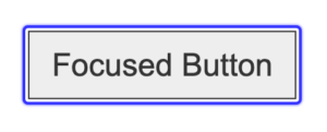
SC 2.4.13 Focus Appearance (Level AAA)
SC 2.4.13 is concerned with the visibility of author-created focus indicators. It complements aspects of two existing SCs: 2.4.7 Focus Visible (which requires that focus indication must be visible) and 1.4.11 Non-Text Contrast (which, among other things, requires that focus indication has a minimum 3:1 contrast against adjacent colors).
This new SC has additional requirements for the contrast between focused and unfocused states, and for the overall size of the focus indicator. So it goes beyond those earlier SCs by requiring not just visibility, but a minimum level of visibility.
This benefits all keyboard users, particularly some users with low-vision, cognitive or memory impairments, by ensuring that it’s easy to identify where the focus position is.
The existing SC 1.4.11 requires focus indicators to have minimum contrast with adjacent colors, but does not explicitly require the difference between focused and unfocused states to also have minimum contrast. But the new SC 2.4.13 is specific about this: the difference between the focus indicator, and the same pixels it would take up when the focus indicator is not shown, must have a minimum 3:1 contrast. This is because a low-contrast change in state will be difficult for some users to discern; if an element’s focus state is visually very similar to its unfocused state, then they might not perceive the difference.
So for example, if a button has a white border that changes to blue when it’s focused, then the difference between the white and blue colors must be a minimum of 3:1. If the focus indicator is an outline, then the contrast would be compared against the surrounding background, since outlines are only present when they’re visible.
Finally, 2.4.13 requires that the focus indicator itself is at least as large as a 2px perimeter of the unfocused element. The perimeter
can be thought of as the element’s border style, so a 2px border or outline would meet this requirement.
If focus indicators are not enclosing borders or outlines, for example, a single solid-line inside the element, or a non-rectangular boundary defined by vector graphics, then the focus indicator will pass if its total area is equivalent to a 2px perimeter. The calculations for this can get quite complicated, so for more details it’s best to read the understanding docs: Understanding SC 2.4.13: Focus Appearance.
How to meet 2.4.13
The simplest way to meet this SC is to use solid outlines for focus indication. An outline style of 2px solid is sufficient. Dotted or dashed outlines can still be used, however since they only render half the area of a solid outline, the minimum width would have to be 4px.
A focus outline is visible when the element is focused, and not present at all when it isn’t, so here the contrast ratio is between the outline and its background. For a change in border-color, the contrast ratio would be between the focused and unfocused colors.
If an outline is used, then this can be moved slightly away from the element using outline-offset, to make it even clearer, and ensure that it also passes 1.4.11 Non-text Contrast:
Native focus indicators, provided by the browser, will only pass if neither the indicator nor the background has been author-modified. Focus indicators that can’t be author-modified, such as visual tracking indicators added by assistive technology, automatically pass.
SC 2.5.7 Dragging Movements (Level AA)
SC 2.5.7 deals with interfaces that use pointer dragging movements, such as drag and drop, drag sorting, custom sliders and carousels. It requires that any interface which has this functionality can also be operated by a single pointer without dragging movements.
Even the simplest dragging movement needs quite precise pointer control, which may not be possible for users who have issues with fine motor control, or who use assistive technology that simulates pointer movement from voice commands or other input.
The current SC 2.5.1 Pointer Gestures doesn’t apply to drag and drop, because it isn’t a multipoint or path-based gesture. With drag and drop, you grab an element at one location (Point A) and then drop it somewhere else (Point B), but the path your pointer takes to get from A to B is not significant, only the end point matters, therefore it’s not a path-based interaction.
This new SC 2.5.7 is specifically for the case of dragging movements, where the whole motion may be difficult for some pointer users to perform.
How to meet 2.5.7
Drag and drop scripting can be designed (or retrofitted) to also support point-and-click. The user could still grab an element and drag it from A to B as before, but they could also click the element at A, release the pointer, and then click the target B, to move the element from A to B. Alternatively, draggable widgets could include actionable menus, that specify where to move them.
Interfaces like drag sorting and carousels can have additional controls, like up/down or left/right buttons, or text-based input (e.g. sort-position or slide numbers). Sliders will pass if the user can click the track to move the slider to that position, or if they have additional left/right buttons.
Note that keyboard accessibility alone is not sufficient. Any drag and drop interface should be keyboard accessible (or an alternative interface provided which is), but that in itself is not sufficient to meet 2.5.7; this SC is only concerned with pointer interaction. However text-based input is sufficient to meet this SC, because text input is considered to be mode-agnostic.
SC 2.5.8 Target Size (Minimum) (Level AA)
SC 2.5.8 is a downgraded version of the current SC 2.5.5 Target Size (which is Level AAA), relaxing the size requirements and making it a AA checkpoint. SC 2.5.5 itself has also been renamed in WCAG 2.2, and is now 2.5.5 Target Size (Enhanced).
Whereas 2.5.5 requires most interactive elements to have a minimum pointer-target size of 44×44 CSS pixels, this new SC 2.5.8 only requires a target size of 24×24 pixels. But it also includes an exception for target spacing, which allows the targets to be less than 24×24, if they’re far enough away from each other.
This benefits users with imprecise or unsteady pointer mobility.
The spacing exception is described in terms of overlapping circles. For each target element that is smaller than 24×24, imagine you drew a circle with a 24px diameter (12px radius), that is centered over the target. If none of those circles overlap each other, or any other target (of any size), then the spacing exception is passed.
SC 2.5.8 does not apply to elements that are solely defined by the browser, so things like native radio controls and checkboxes are exempted, if they have no author styling. However styled or custom radio controls and checkboxes are included, because they’re designed by the author not the browser.
Interactive elements that are constrained by the line-height of non-target text are also exempted from this SC. Primarily this refers to text-based links within a paragraph, where the link can’t be taller without disrupting the overall line spacing, which decreases readability. Therefore the height is constrained. However, this exemption doesn’t universally cover all text-based links — if the size of the link is not constrained by the line-height of surrounding text, then the exception doesn’t apply.
In the case of composite controls such as sliders, which have a small thumb within a larger track, the composite control itself is considered for the purposes of target size, i.e., the whole slider, not just the thumb inside it.
Page zoom is not a factor in target size. CSS pixels don’t change with zoom level, so an element that’s 16×16 at 100% zoom, is still 16×16 at 400% zoom. There’s no loophole for controls that could be larger if the user zooms.
How to meet 2.5.8
The simplest way to meet this SC is to ensure that all applicable pointer targets have a minimum size of 24×24 pixels.
The pointer-target size is not necessarily the same as the visible target size. For example, a graphical button with a visible icon that’s 16×16, but has 4px padding on every side, adds up to a pointer-target of 24×24.
However 24×24 is still quite small, and could still be difficult for some users who have issues with fine motor control. So the best advice I can give is to ignore this SC entirely and follow the requirements of 2.5.5 Target Size (Enhanced) instead (minimum 44×44).
Meeting 2.5.5 will also meet 2.5.8.
SC 3.2.6 Consistent Help (Level A)
SC 3.2.6 is about the consistent placement of information that provides general help to users, including points of human contact, and automated help mechanisms. So this would be things like a chat window, or a telephone number or email address, at which users can get help with the site, or with the company’s service in general. This SC does not require that such things be provided, only that if they are provided, they can be found in a consistent location.
This is helpful for all users, but may particularly benefit some users with cognitive or memory impairments.
For example, if you provide a help-line for users, and the phone number for this help-line is in the header, then it should always be in the same place in the header, on every page where it appears. In these terms, same place
refers to its source position, not its visual position, i.e. the same place within a serialized representation of the page. This SC only applies if the help mechanism is repeated on multiple pages; if it only appears on one page then 3.2.6 doesn’t apply.
Note that 3.2.6 is not concerned with contextual help, such as notes or tooltips underneath a form field that give help for completing the field. That kind of contextual help is already covered by the existing SC 3.3.5 Help (I Need Somebody).
How to meet 3.2.6
Meeting this SC comes down to consistent templating. If you provide this kind of information on multiple pages, then make sure it’s always in the same place. Chances are, you’re already doing that.
Whether this help amounts to direct information (such as a phone number), or is a link to another page on which that information can be found, is not significant; the requirements of 3.2.6 apply to the information or link as it’s presented.
Differences in visual position don’t actually fail this SC, if the source position is consistent. However it’s better if the visual position is also consistent.
SC 3.2.6 is specifically concerned with points of contact that are channels for getting help, and in plain language, contact does not imply help. However the normative requirements explicitly define a help mechanism
in terms of contact
, therefore all points of human contact should be considered help mechanisms.
SC 3.3.7 Redundant Entry (Level A)
SC 3.3.7 is about preventing users from having to re-enter information they’ve already entered before (within the same process), to reduce cognitive load.
This may be beneficial for users with cognitive or memory impairments, and also for users with mobility impairments who rely on voice-recognition or switch controls, for whom data entry can be extremely laborious.
So for example, a multi-page application form might ask for the user’s name and address in more than one place. When it does this, the information they’ve already entered must either be pre-populated in the form, or available for them to select from. The exceptions to this are where it’s essential that they re-enter the information (such as entering a new password twice to verify that they’re the same), or where the previous information is no longer valid.
This SC does not apply in cases where the previously-entered information was in a different format. For example, if an online application requires the user to upload their Resume in a document format, and also requires them to enter their employment history in a web form, then this is not covered by 3.3.7.
However it does still apply in cases where the user can populate fields using their browser’s autocomplete, or similar tools. Although that would be sufficient to meet 3.3.8 Accessible Authentication (Minimum), it is not sufficient to meet 3.3.7.
How to meet 3.3.7
It’s fairly simple to implement the session logic for pre-populating fields using information the user has already entered. Alternatively, providing for users to select prior information could be implemented as a <select> element, it could be a checkbox for something like “Use my billing address as the shipping address”, or it could just be text on the same page that the user can copy-paste from.
SC 3.3.8 Accessible Authentication (Minimum) (Level AA)
SC 3.3.8 is concerned with cognitive function tests that are used to authenticate users, such as solving a puzzle, or remembering a password. This SC requires that if such tests are used, then either an alternative is available that doesn’t rely on a cognitive function test, or a mechanism is available to help users complete it.
Cognitive function tests may be difficult or impossible for some users to complete, for example, if they have cognitive issues with memory, reading, numeracy, or perceptual processing.
CAPTCHA tests that ask you to identify an obfuscated word are included in this SC. However tests that ask you to identify a familiar object are specifically excepted:
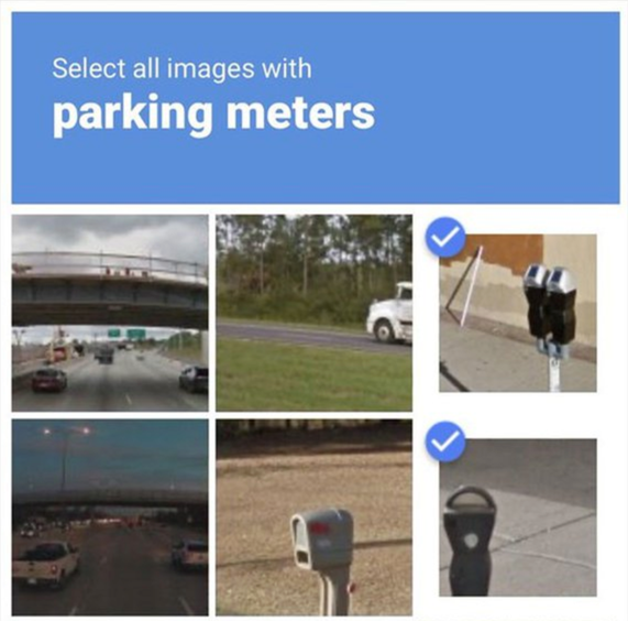
Even though this is a cognitive function test, it’s listed as an exception because the objects are generally familiar to users. Being able to recognize, say, a street light or a car, is considered sufficiently easy. There is still the potential for cultural lack of familiarity — the images in these tests are generally US urban scenes, which include objects you may have never seen before, or don’t know what they’re called. But this is not an accessibility issue, so it’s not considered as part of WCAG.
Note that the “object” in object recognition tests is not limited to images, it also includes video or audio content.
A further exception is for non-text content that the user themselves has provided to the site. For example, images from the user’s own profile can be used for a cognitive function test, even if they wouldn’t otherwise be considered to be objects, and a possible application would be a set of faces that asks you to recognize yourself. Text-based personal content is not included in this exception, because that relies on recall rather than recognition.
The definition of “cognitive function test” includes anything that requires the user to remember and transcribe information, and this includes username and password authentication. However if the site allows for password managers to be used, then that’s a mechanism which helps users to complete it. That kind of input would only fail if the site is explicitly blocking support for those tools, and the most likely cause of that would be preventing copy-pasting into username and password fields. Some sites do this for ‘security reasons’, but that is now an explicit failure of SC 3.3.8 (for which no exception is allowed on the basis of security, because there aren’t actually any security issues with copy-pasting into username and password fields).
The specific exceptions to this are fields that request the user’s name, email address, or phone number; those things are personal information that doesn’t change between different sites, and therefore inputting them is not considered a cognitive function test.
How to meet 3.3.8
The first way to meet this SC is to ensure that all forms of authentication input (such as username and password fields) support copy-pasting their values. It’s also a good idea to include an autocomplete attribute on all fields that ask for a user’s own information (as described in the existing SC 1.3.5 Identify Input Purpose), even though this is not strictly required by 3.3.8.
Over and above that, it’s best to avoid using CAPTCHA or similar gatekeeping tools, which can never be fully accessible. But if you do use those things, then ensure that other forms of authentication are available; Two-Factor Authentication (2FA) is usually a good option.
Note however that the 2FA itself must also meet the same requirements. If a verification code is used, for example, then there must be a mechanism available for the user to complete the process, such as copy and paste. Therefore if copy-pasting isn’t possible, or if the verification process requires the user to only enter specific digits (such as the 3rd and 5th digit of a 6-digit code), then this would fail, because it’s a requirement to transcribe information.
Some sites implement 2FA by requiring the whole code to be entered using individual fields (i.e., one field per digit). If (and only if) it’s possible to paste the entire code into an individual field, and have it automatically propagated to single digits across all fields, then this would pass. Otherwise it would fail.
If the code is sent to a separate device, such as via SMS, then it’s not necessary to validate whether users can copy or transfer the code between devices. Only the final input needs to be tested.
Something simpler, like a temporary URL where the user can just click a link in an email or text message to validate themselves, would be fine. The use of biometric authentication, such as fingerprint scanning or facial recognition, also meets this SC.
Hiding authentication information as it’s entered does not fail this SC, for example, using a type="password" field which obscures the input characters. However it is still a good idea to include “show password” functionality.
SC 3.3.9 Accessible Authentication (Enhanced) (Level AAA)
SC 3.3.9 is identical to 3.3.8, except that it has no exceptions for object recognition tests or personal content.