I have been working on the web either as a developer or an accessibility practitioner for many, many moons; more moons than I dare to think about. I’d like to think that I have a good grasp on some of this stuff, but just the other day I found myself questioning my understanding of one specific WCAG success criterion that I had not previously had any doubt about. Ultimately it resulted in a very long conversation with a colleague about a fine detail. What I thought would be done and dusted in a matter of minutes—”Hey, I have a quick question for you …”—turned into an hour-long back-and-forth discussion over chat. I won’t lie, it was all quite exhausting! What caused such a fuss and bother?
What De Facto?
There are many aspects of web design that have become de facto standards. In other words, it may not be that there was ever a hard-and-fast rule about how something should be laid out/designed, but has come about through years of repetition. Breaking away from such trends only causes usability problems, whether the de facto standard is actually the best approach or not; it’s all about familiarity.
For example, in web design terms we have pretty much standardized on:
- Search appearing in the top of the page in a header, often lacking a visible text label for the search box (because we know what it is, right?).
- Site navigation on left-hand side, stacked vertically.
- ‘Save’ actions that are indicated by an antiquated floppy disk image, even though almost no one has used one of these in well over 20 years.
So, what has this got to do with accessibility, and my rather unintentionally long conversation from the other day? The issue was regarding the position of a form field label. Specifically, it was regarding a checkbox where the label for that checkbox came before the checkbox control.
Positions of Form Field Labels: Some Assumptions
So, this is the expectation that people have when it comes to forms:
- Radio and checkbox controls precede the text label for those controls.
- With all other controls–for example, text input, select, textarea– the label should appear to the left (at least in left-to-right languages), or above the control.
All pretty straightforward, right?
With that second collection of form controls, pretty much no one breaks the rules. (Although Google kind of broke those rules, at least in terms of the order in the DOM, with the Material design. This was to achieve the very questionable ‘floating labels’ technique that required CSS adjacent selectors for it to work). [Other more compliant floating label patterns are available.]
With radios and checkboxes, on the other hand, I do see these in the wrong order with some level of regularity.
I was doing some QA for another auditor who flagged one such instance of this under SC 3.3.2 Labels or Instructions (Level A). “Oh no, this is not a failure,” I wrote, confident in that statement. “This is one of those classic cases of ‘convention, it’s what is expected, it’s just very good practice’… but not technically a failure of 3.3.2” .
Terms of Oh Dear-ment
Off the top of my head, I could immediately think of an example where the usual, expected position of a checkbox, and its label is routinely broken: the “I agree to these terms and conditions…” statement at the end of application or registration forms. At no point, while auditing, have I ever thought to fail this under any success criterion. And, to be quite honest, I can totally understand the logic in this specific example. After completing an application form or a signup form, the website is essentially saying “Do you agree to all of these statements?” before then giving you the control that allows you to accept those conditions. It kind of makes sense that it is ordered in that way, and so failing it under 3.3.2 seems somewhat unfair. In reality, the positioning of the label and the checkbox this way round is likely not causing anyone an issue at all.
However, this being the industry that we are in, it does very much depend on the context. So let’s look at some examples of label position, specifically with regard to checkboxes and radios, and see what we feel about some of these. Which of these examples below would you fail if you were the auditor?
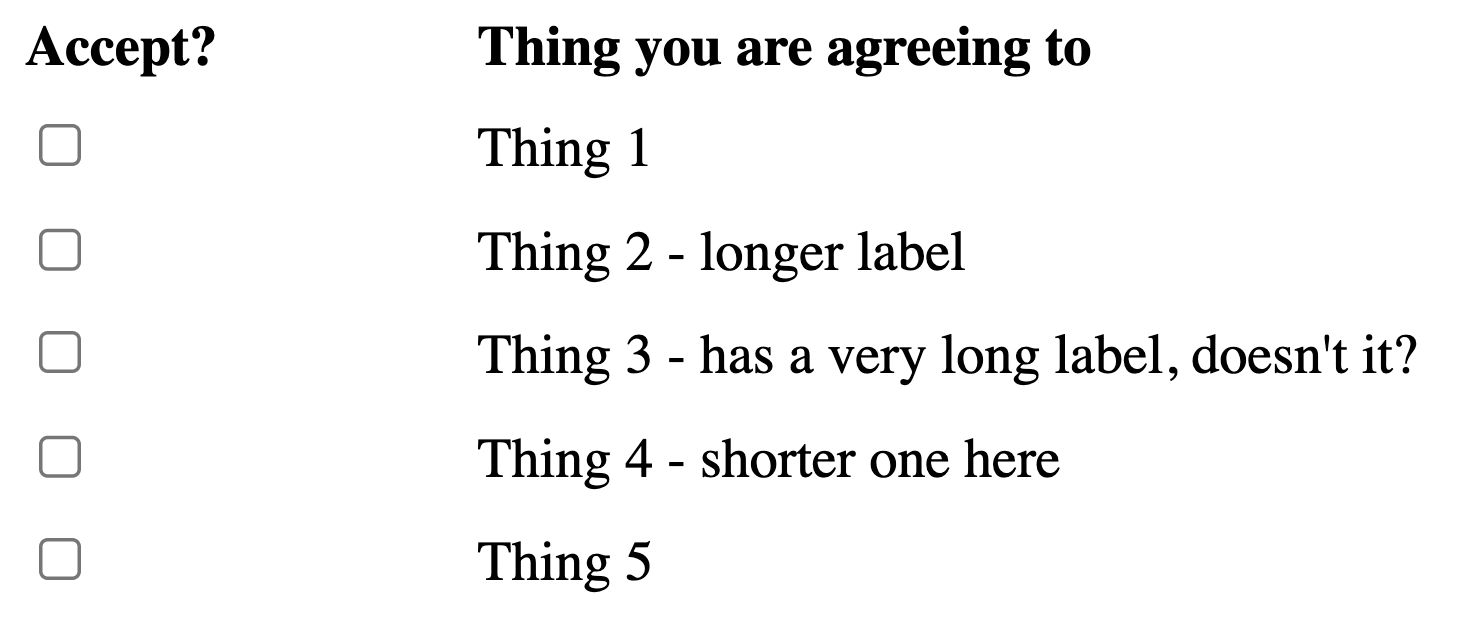
Terms & Conditions Acceptance Checkbox
Here’s an example of one of these terms and conditions checkboxes. Something tells me that the terms here are not entirely to be trusted, but I would not fail the position of this for SC 3.3.2 Labels or Instructions.
Rearranging it so that the checkbox comes first is an easy thing to do, but it’s debatable how much that helps most users:
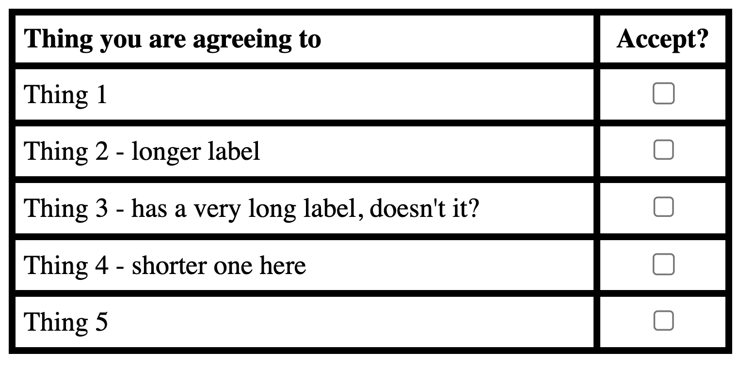
Tabular Layouts
Here’s an example of checkboxes set in a table where the associated label is in an adjacent cell. It doesn’t look too bad in this example if you have a narrow viewport. The table’s grid provides some guidance that connects the two elements.
VIew HTML Version
| Thing you are agreeing to | Accept? |
|---|---|
When the viewport size is larger, though, the distance between these two columns can be more problematic (even with the table gridlines providing some support).
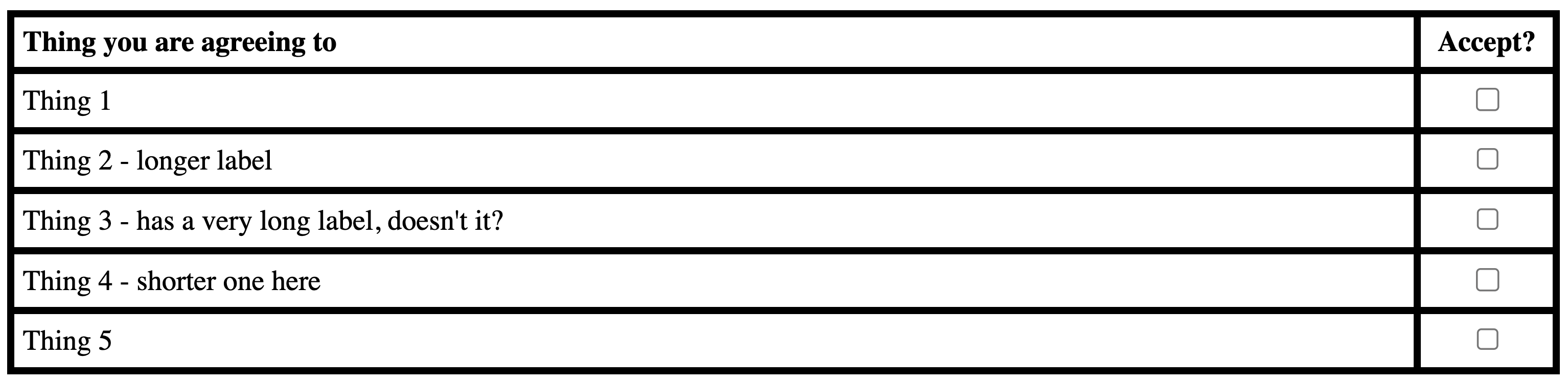
Strip away those table gridlines and now this starts to get very difficult to associate the checkboxes with the related text labels:
VIew HTML Version
| Thing you are agreeing to | Accept? |
|---|---|
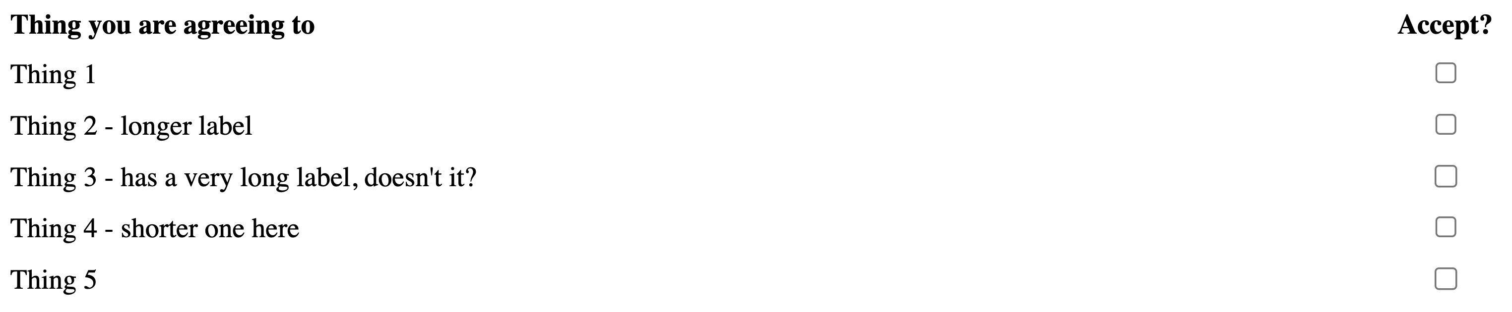
Even if you re-order the columns such that the checkbox precedes the label, you might still get some funkiness due to the way that the table column widths are calculated. Correct order, but that large gap between the control and related text is problematic.
VIew HTML Version
| Accept? | Thing you are agreeing to |
|---|---|
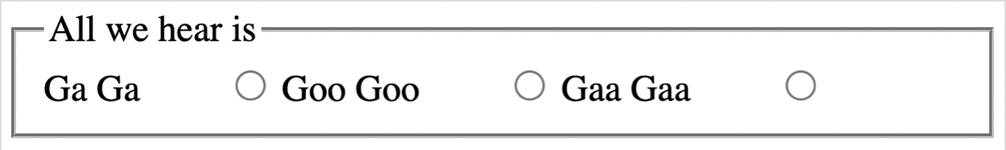
Radio Ga Ga
Here’s a more obvious example where the position of the control and its text label is likely to cause huge confusion.
VIew HTML Version
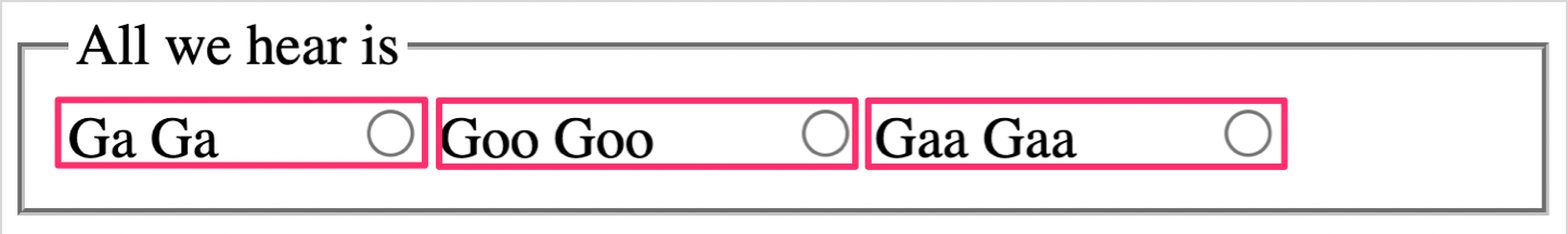
Padding/spacing to the right of the text has the effect of pushing the radio control further out, closer to the next text element, so while the intent was to group the radios like this:
It is highly likely that the controls will be misattributed, as shown below:
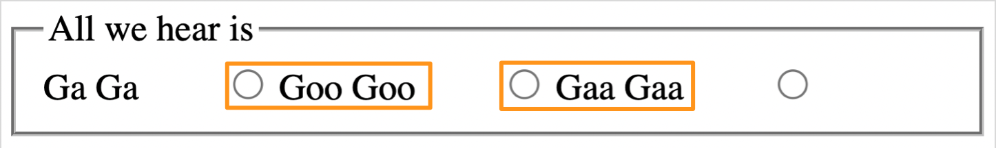
With such a layout, there is a very strong risk that the person completing the form could answer incorrectly, possibly with serious consequences. I’d have no problem failing this under SC 3.3.2 Labels or Instructions. It’s a world away from the Terms & Conditions checkbox example. Also, having the radio control after the text makes a mockery of my Radio Ga Ga examples. “Ga Ga Radio?” … said no-one, ever.
Let’s Switch It Up a Gear
One final example to consider. Here is a switch. Like a checkbox, it is a control that has a distinct on/off state. The text is to the left, the control is to the right. Is this a failure of 3.3.2? I mean, it doesn’t look like a checkbox or a radio, so what rules apply here?
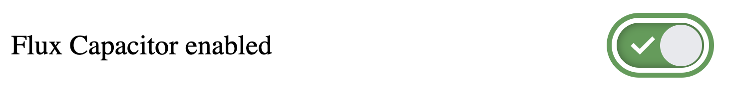
Now let’s throw another spanner into the works: this control above is actually implemented as an HTML checkbox but styled to look like an on/off toggle switch. So, does that change your thinking on things?
<div class="switch">
  <label for="switch">
    <span>Flux Capacitor enabled</span>
    <span></span>
  </label>
  <input type="checkbox" id="switch" class="visually-hidden">
</div>
Note: You might want to check out TPGi’s Switch pattern over on CodePen.
What’s the WCAG Position on Position?
With some of these examples, you can definitely imagine seeing them in the wild; they are not just contrived examples for me to make a point of some kind. Some of them would certainly benefit from a design rethink, while others are unlikely to cause issues for most people. With that in mind, is it fair to fail checkbox or radio, regardless of context, for having the text label appearing before the control? We should go back to WCAG’s wording on this, once again, to help us decide. 3.3.2 simply states:
Labels or instructions are provided when content requires user input.
Hmm, that doesn’t exactly provide a wealth of information. So let’s see what it says in the 3.3.2 Understanding doc:
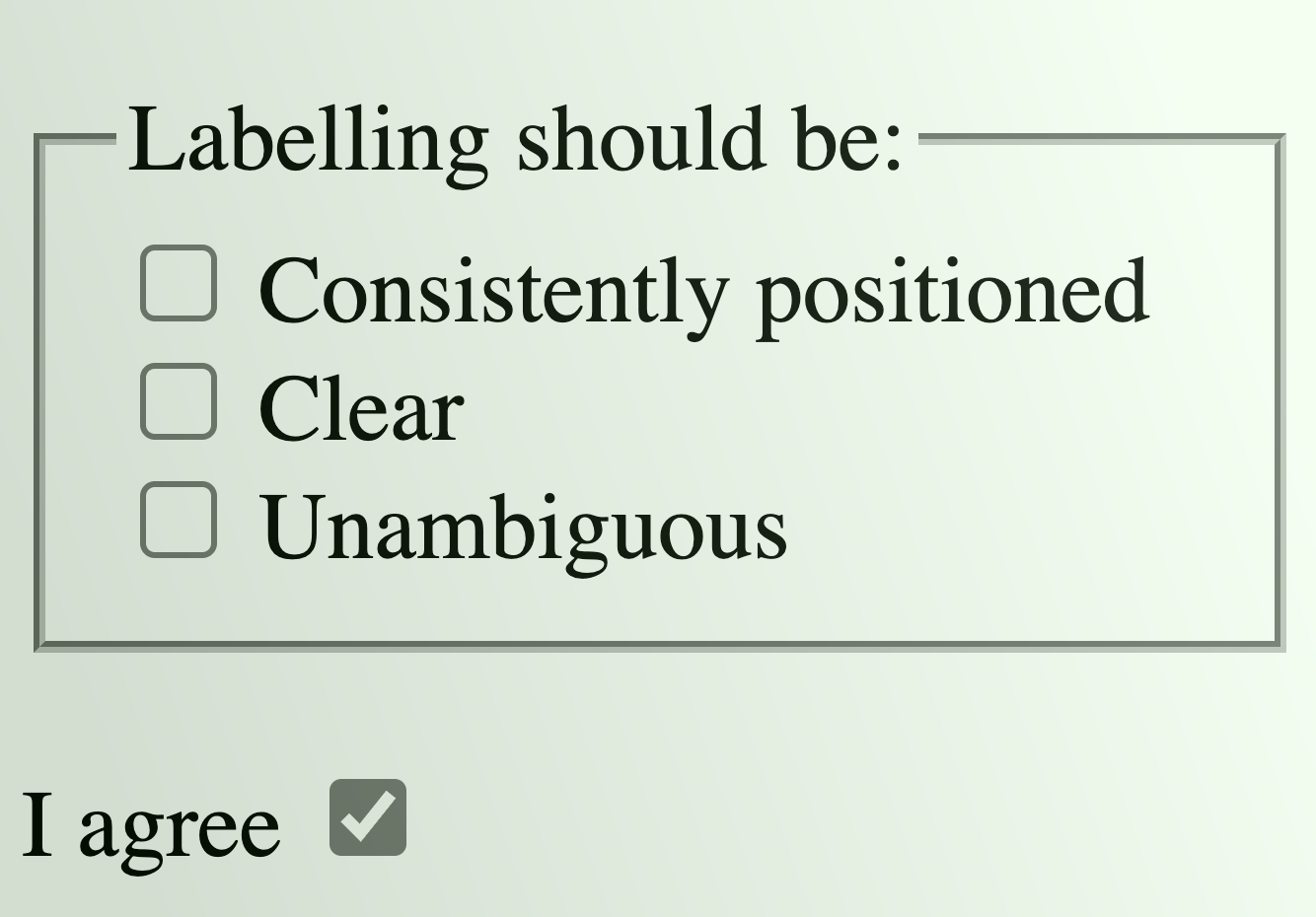
Providing clear and unambiguous labels and instructions (including examples of expected data formats) helps all users – but particularly those with cognitive, language, and learning disabilities – to enter information correctly.
I cherry-picked this snippet because it emphasizes the need for “clear and unambiguous labels”, but it doesn’t really mention position, or how the position of labels can affect some people. A little more digging, then:
Labels for most fields are positioned immediately before the field, that is, for left-to-right languages, either to the left of the field or above it, and for right-to-left languages, to the right of the field or above it. Labels for radio buttons and checkboxes are positioned after the field.
Aha, there it is! Tucked away in the (non-normative) technique Positioning labels to maximize predictability of relationships.
Taking the examples above some are definitely not clear, some will be ambiguous for some people. How ambiguous may depend on a number of factors. For example:
- Has the user got a very limited field of vision?
- Are they using screen magnification (which prevents the label text and the control appearing together)?
- Does the distance of the checkbox from the label depend on the viewport size? (Like the ‘checkboxes in a table’ example shown earlier, it may look great in a mobile setting, but horrible in a desktop browser window).
Conclusion
So, after all that, do I believe that any radio or checkbox that comes after its related text is an automatic failure? No, I do not. I’ll still be letting those T&C checkboxes through unchallenged. What I have come to learn, though, is that I have probably been more lenient in the past on some more questionable designs when I could have—and should have—hit them with the WCAG stick of conformance; a rap over the knuckles for not being clear and unambiguous.